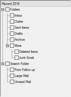
In TreeView, you can customize the way icons appear for expand buttons and check boxes.
To customize the icons for expand buttons, you need to set the ExpandButtonStyle property provided by the TreeViewStyles class. The property accepts values from the ExpandButtonStyle enumeration. By using the values, you can set any of standard System, VS2015, or Windows10 views for the expand buttons. To customize the icons for check boxes, set the CheckBoxStyle property of TreeViewStyles, which accepts values from the CheckBoxStyle enumeration. Using those values, you can set any of the standard System, MS Office, or Windows10 views for the check boxes.
Notice that you can use ExpandButtonStyle and CheckBoxStyle properties only after accessing TreeView styles by using the Styles property of C1TreeView.
The following code snippets demonstrate the implementation.