C1TrueDBGrid Designer Elements
In This Topic
This designer allows grid columns to be set up easily at design time instead of having to write code. Just select the grid, then right-click to bring up the context menu, and then click the Design menu item. This will bring up the C1TrueDBGrid Designer shown below:
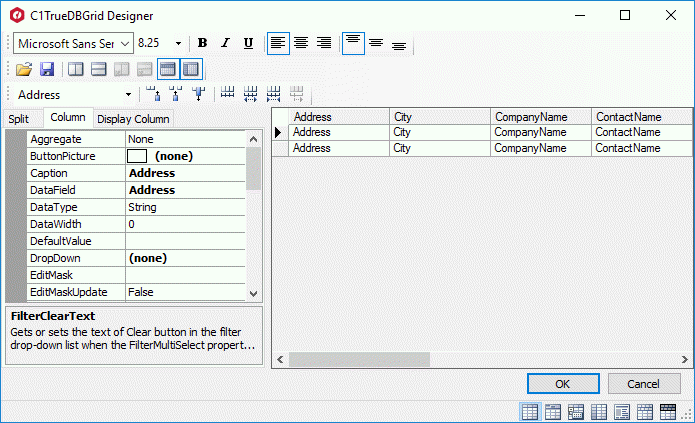
The editor displays the grid columns in a window on the right and the properties for these columns on the left. The tabs above the Properties window define which set of properties, DataColumn, DisplayColumn, or Split, are displayed in the properties grid.
The editor performs the following actions:
- Reorder Columns: Move columns to new positions by dragging them by the header cells with the mouse.
- Adjust Column Widths: Adjust column widths by dragging the right edge of the header cells with the mouse. You can also select multiple columns by SHIFT-clicking the header cells, and then set all column widths at once using the property grid. Setting the column width to -1 restores the default width.
- Set Column Properties: Whenever one or more columns are selected, their properties can be viewed and edited in the property grid on the left of the editor.
- Insert or Remove Columns: Use the toolbar to insert columns before or after the selection (useful mostly in unbound mode), or to remove columns.
- Use the Toolbar to Perform Common Tasks: The table below describes the function of the buttons on the toolbar:
| Element | Description |
|---|---|
 |
These tabs above the property grid determine which set of properties are available for modification in the designer. The tabs allow you to choose between the DataColumns property set that contains data-related column properties, the DisplayColumns property set that contains display-related column properties, and the Split property set that contains split-related properties. |
 |
These toggle buttons control the display of the property grid. The left button one indicates that the properties for the selected columns are displayed in categorized order. The right button indicates whether the properties for the selected columns are displayed in alphabetical order. |
 |
These buttons set the column widths for the grid. The left button sets all the columns to have the same width, the center button increases the width of the selected column (the column with focus in the grid), and the right button decreases the width of the selected column (the column with focus in the grid). |
 |
These buttons add, insert, and delete columns from the grid. The first adds columns to the grid, the second button inserts columns in the grid, and the third button deletes columns from the grid. |
 |
The drop-down box sets which column receives focus. By choosing a column from the drop-down list, the associated properties for this column will appear in the property grid to the left. |
 |
These buttons set the vertical alignment of the selected column. The first button aligns all column content to the top. The second button aligns all column content to the center, and the third button aligns all column content to the bottom. |
 |
Align column content to the left, center, or right. These buttons only affect the scrollable area of the grid. To set the alignment for the header columns, select the columns and set the TextAlignFixed property. |
 |
These buttons add or remove vertical or horizontal splits. The first button adds a vertical split to the grid, while the second one adds a horizontal split. The third button removes a vertical split, while the fourth one removes a horizontal split. |
 |
These buttons set the DataView property of the table. The buttons set the DataView property to Normal, GroupBy, Hierarchial, Inverted, Form, MultipleLines, and MultipleLinesFixed, respectively. See Data Display for more information. |
See Also