Collection Editors are designer-based editors used to add, remove or edit items in an object collection at design-time. True DBGrid provides different types of Collection Editors, such as Split Collection Editor, Display Column Collection Editor, ValueItem Collection Editor, Data Column Collection Editor and Style Collection Editors.
The SplitCollection is a collection of Split objects which provides access to most of the grid's display properties and properties specific to a Split.
The SplitCollection can be modified at design-time through a .NET collection editor. The collection editor for the SplitCollection can be accessed by clicking on the ellipsis button (...) next to the Splits property in the Properties window.
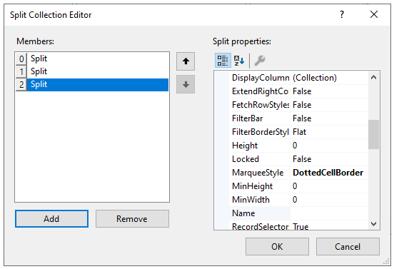
The following SplitCollection object properties are available in the Split Collection Editor through the Properties window:
| Property | Description |
|---|---|
| AllowColMove | Gets or sets a value indicating the ability to move columns. |
| AllowColSelect | Gets or sets a value indicating the ability to select columns. |
| AllowFocus | Gets or sets a value indicating whether the split can receive focus. |
| AllowHorizontalSizing | Gets or sets a value indicating whether a user is allowed to resize horizontal splits. |
| AllowRowSelect | Gets or sets a value indicating the ability to select rows. |
| AllowRowSizing | Gets or sets how interactive row resizing is performed. |
| AllowVerticalSizing | Gets or sets a value indicating whether a user is allowed to resize vertical splits. |
| AlternatingRowStyle | Gets or sets a value indicating whether the split uses the OddRowStyle for odd-numbered rows and EvenRowStyle for even-numbered rows. |
| BorderStyle | Gets or sets the type of border rendered for a split. |
| Caption | Gets or sets the caption. |
| CaptionHeight | Gets or sets the height of the caption. |
| CaptionStyle | Gets or sets the Style object that controls the appearance of the caption area. |
| ColumnCaptionHeight | Gets or sets the height of the column captions. |
| ColumnFooterHeight | Gets or sets the height of column footers. |
| DisplayColumns | Gets a collection of C1DisplayColumn objects. |
| EditorStyle | Gets or sets the Style object that controls the appearance of the cell editor within a grid. |
| EvenRowStyle | Gets or sets the Style object that controls the appearance of an even-numbered row when using AlternatingRows. |
| ExtendRightColumn | Gets or sets a value that determines how the last column will extend to fill the dead area of the split. |
| FetchRowStyles | Gets or sets a value indicating whether the FetchRowStyle event will be raised. |
| FilterBar | Gets or sets a value indicating the visibility of the FilterBar. |
| FilterBarStyle | Gets or sets the Style object that controls the appearance of the FilterBar. |
| FilterBorderStyle | Controls the appearance of the separator for the FilterBar. |
| FooterStyle | Gets or sets the Style object that controls the appearance of column footers. |
| HeadingStyle | Gets or sets the Style object that controls the appearance of the grids column headers. |
| Height | Gets or sets the height of a split. |
| HighlightRowStyle | Gets or sets the Style object that controls the current row/cell when the MarqueeStyle is set to Highlight Row/Cell. |
| HorizontalScrollGroup | Gets or sets the group which synchronizes horizontal scrolling between splits. |
| HScrollBar | Gets the HBar object that controls the appearance of the horizontal scroll bar. |
| InactiveStyle | Gets or sets the Style object that controls the grids caption when it doesn't have focus. |
| Locked | Gets or sets a value indicating if the cells of a split can be edited. |
| MarqueeStyle | Gets or sets the MarqueeStyle for a Split. |
| MinHeight | Gets or sets the minimum height that a split can be interactively resized. |
| MinWidth | Gets or sets the minimum width that a split can be interactively resized. |
| Name | Gets or sets the name of a split. |
| OddRowStyle | Gets or sets the Style object that controls the appearance of an odd-numbered row when using AlternatingRows. |
| RecordSelectors | Gets or sets a value indicating the visibility of row headers for Split. |
| RecordSelectorStyle | Gets or sets the Style object that controls the appearance of the RecordSelectors. |
| RecordSelectorWidth | Gets or sets the width of the row headers. |
| SelectedStyle | Gets or sets the Style object that controls the appearance of selected rows and columns. |
| SplitSize | Gets or sets the size of a split. |
| SplitSizeMode | Gets or sets a value indicating how the SplitSize property is used to determine the actual size of a split. |
| SpringMode | Gets or sets a value that determines how columns will resize when the grid is resized. |
| Style | Gets or sets the root Style object for the Split. |
| VerticalScrollGroup | Gets or sets the group which synchronizes vertical scrolling between splits. |
| VScrollBar | Gets the VBar object that controls the appearance of the vertical scroll bar. |
The C1DisplayColumnCollection is a collection of the column properties which relate to display, color, font, and so on. This editor is accessible by clicking on the ellipsis button next to the DisplayColumns property in the Split Collection Editor.
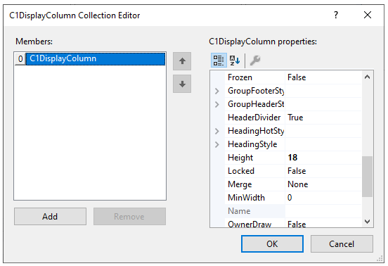
The following C1DisplayColumnCollection object properties are available in the C1DisplayColumnCollection Editor in the Properties window:
| Property | Description |
|---|---|
| AllowFocus | Gets or sets a value indicating the ability of a column to receive focus. |
| AllowSizing | Gets or sets a value indicating whether column resizing is allowed. |
| AutoComplete | Gets or sets a value indicating whether the drop-down auto fills the edit portion with the matched entry. |
| AutoDropDown | Gets or sets a value indicating whether the drop-down opens automatically when a key is typed. |
| Button | Gets or sets a value indicating whether a drop-down button will be displayed in this column. |
| ButtonAlways | Gets or sets a value indicating whether buttons will be displayed when the cell does not contain focus. |
| ButtonFooter | Gets or sets a value indicating whether a column footer will act like a button. |
| ButtonHeader | Gets or sets a value indicating whether a column header will act like a button. |
| ButtonText | Gets or sets a value indicating whether cells in this column look like buttons. |
| ColumnDivider | Gets or sets the style of the border drawn between columns. |
| DropDownList | Gets or sets a value indicating whether the drop-down acts like a drop-down list (text portion is not editable). |
| EditorStyle | Gets or sets the Style used for the cell editor. |
| FetchStyle | Gets or sets a value indicating whether the FetchCellStyle event will be raised for a column. |
| FilterButton | Gets or sets a value indicating whether a drop-down button will be displayed in this column. |
| FooterDivider | Gets or sets a value indicating whether to display the column divider in the footer area. |
| FooterStyle | Gets or sets the Style object that controls the appearance of column footers. |
| Frozen | Gets or sets a value indicating whether the column scrolls. |
| GroupFooterStyle | Gets or sets the Style used to render the cell in the grouped footer row. |
| GroupHeaderStyle | Gets or sets the Style used to render the cell in the grouped header row. |
| HeaderDivider | Gets or sets a value indicating whether to display the column divider in the header area. |
| HeadingStyle | Gets or sets the Style that controls the appearance of the column headers. |
| Height | Gets or sets the height of the column. |
| Locked | Gets or sets a value indicating whether editing is permitted in a column. |
| Merge | Gets or sets a value indicating whether contiguous like-value cells of this column are merged into one large cell. |
| MinWidth | Gets or sets the minimum width a column can be resized to when in SpringMode. |
| Name | Gets the caption of the associated C1DataColumn objects. |
| OwnerDraw | Gets or sets a value indicating whether cells in this column are drawn by the user in the OwnerDrawCell event. |
| Style | Gets or sets the root Style for this column. |
| Visible | Gets or sets a value indicating the visibility of a column. |
| Width | Gets or sets the width of a column. |
The DataColumnCollection represents collection of columns that define binding information for the data source. The DataColumn Collection Editor is accessible by clicking on the ellipsis button next to the Columns property in the Properties window.
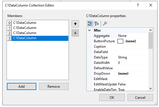
The following C1DataColumnCollection object properties are available in the C1TrueDBGrid Designer through the Column tab:
|
Property |
Description |
|---|---|
|
Gets or sets the type of aggregate computed for a grouped row. |
|
|
Gets or sets the image shown in a drop-down button in a column. |
|
|
Gets or sets the text in the column header. |
|
|
Gets or sets the database field name for a column. |
|
|
Gets or sets the maximum number of characters which may be entered for cells in this column. |
|
|
Gets or sets the default value for a column when a new row is added by the grid. |
|
|
Gets or sets the C1TrueDBDropDown control associated with this column. |
|
|
Gets or sets the edit mask for a column. |
|
|
Gets or sets a value indicating whether literal characters in the edit mask are stored to the underlying data source. |
|
|
Gets or sets the characters that should be escaped when applying the filter criteria to the data source. |
|
|
Gets or sets the image show in the filter button for the column. |
|
|
Gets or sets a value indicating whether a drop-down list is displayed in the filter cell that lists all the values of the field. |
|
|
Gets or sets the characters that should be escaped when applying the filter criteria to the data source. |
|
|
Gets or sets the key used to initiate the filtering operation as the user types in the FilterBar. |
|
|
Gets or sets the operator that is used for a filter expression. |
|
|
Gets or sets the data associated with the value of the filter for a column. |
|
|
Gets or sets the text displayed in the column footer. |
|
|
Gets or sets the GroupInfo associated with this column. |
|
|
Gets or sets the level of this column in a hierarchical data source. |
|
|
Gets or sets the formatting string for a column. |
|
|
Gets or sets the state of the sorting glyph in the column caption. |
|
|
Gets the ValueItems object for this column. |
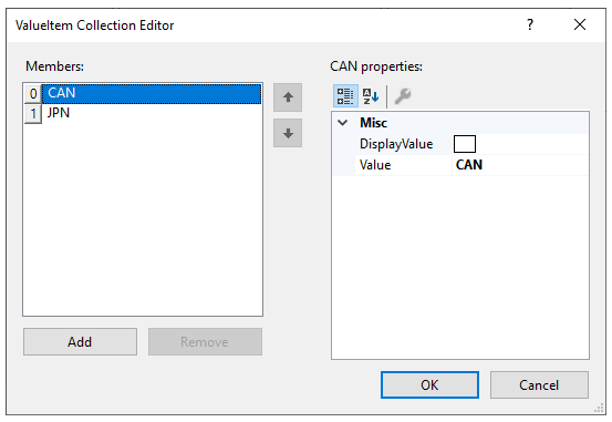
The ValueItemCollection is a collection of values and display values which allows for translated data within a column. In order to make these properties easily modifiable, there is a ValueItem Collection Editor, which is accessible through the Properties window. Clicking the ellipsis button (...) next to the Columns item in the Properties window will bring up the C1TrueDBGrid Designer; then expanding the ValueItems node will expose the ValueItems collection items. Clicking on the ellipsis button next to the Values node will bring up the ValueItem Collection Editor.
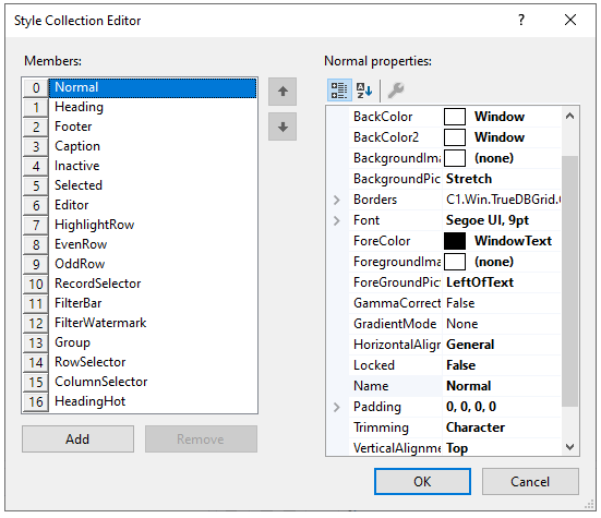
The Style collection is a collection of Microsoft Word-like styles which can associate certain sections for the grid with a style. In order to make these properties easily modifiable, there is a Style Collection Editor which enables the user to add styles and modify the properties of existing styles. The Style Collection Editor is available in the Properties window. Clicking on the ellipsis button (...) next to the Styles node in the Properties window will bring up the editor.