True DBGrid provides a wide variety of built-in controls to implement virtually any kind of drop-down cell-editing interface. For instance, the ValueItems object and its collection of ValueItem objects can be used to provide a simple pick list, or the C1TrueDBDropDown control can be used to implement a data-aware multicolumn combo box.
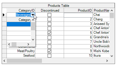
The C1DataColumn object's ValueItems object optionally provides a built-in combo box interface that works in concert with its automatic data translation features. By default, the Presentation property is set to PresentationEnum.Normal, and the usual cell editing behavior is in effect for textual data. However, if the Presentation property is set to either PresentationEnum.ComboBox or PresentationEnum.SortedComboBox, then cells in the affected column display the in-cell button upon receiving focus. When the user clicks the in-cell button, a drop-down combo box appears. The drop-down combo box contains one item for each member of the ValueItemCollection object. If the collection's Translate property is True, then the DisplayValue text is used for the combo box items; if it is False, then the Value text is used.
True DBGrid automatically sizes the drop-down combo box to fit the width of the column in which it is displayed. The height of the combo box is determined by the number of items in the collection and the MaxComboItems property. If the number of items is less than or equal to MaxComboItems, which has a default value of 5, and then all value items will be shown. If the number of items exceeds MaxComboItems, only MaxComboItems will be shown, but a scroll bar will appear at the right edge of the combo box to allow users to bring the other items into view.
The ComboSelect event is fired when the user selects an item from the built-in combo box. This event is useful for determining the contents of the cell before the user exits edit mode.
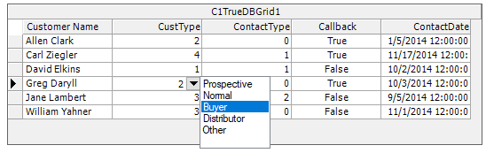
Since the items displayed in the built-in combo box are often the only allowable values for the underlying data source, you may need to prevent your users from typing in the cell after making a selection. By setting the C1DisplayColumn property DropDownList equal to True, the attached C1TrueDBDropDown control will now be limited to use only as a list box. No new values or changes will be allowed in the drop-down and so the underlying database cannot be updated with false information.
The built-in drop-down combo box described in the preceding example is most useful when the allowable values are both known in advance and relatively few in number. A large collection of ValueItem objects can be unwieldy to maintain in the designer, and requires substantial coding to set up. Moreover, the built-in combo box cannot be bound to a data control and be populated automatically.
Using the techniques outlined later in this chapter, set up a secondary C1TrueDBGrid control to be used as a drop-down. However, to display a list of values from another data source, the C1TrueDBDropDown control offers a more elegant solution, as it was designed explicitly for that purpose and can be set up entirely at design time.
To use the drop-down control, set the DropDown property of a grid column to the C1TrueDBDropDown control either in the designer or in code. At run time, when the user clicks the in-cell button for that column, the C1TrueDBDropDown control will appear below the grid's current cell. If the user selects an item from the drop-down control, the grid's current cell is updated.
Since the C1TrueDBDropDown control is a subset of C1TrueDBGrid, it shares many of the same properties, methods, and events. However, the following two properties are specific to the C1TrueDBDropDown control:
| Property | Description |
|---|---|
| ValueMember | This property specifies the drop-down column used to update the associated grid column when a selection is made. |
| DisplayMember | This property specifies the name of the drop-down column to be used for incremental search. |
| AllowSizing | This property specifies a value indicating whether dropdown resizing is allowed or not. |
When a C1TrueDBDropDown control becomes visible, its DropDownOpen event fires. Similarly, when the user makes a selection or the control loses focus, its DropDownClose event fires.
Normally, True DBGrid's default editing behavior is sufficient for most applications. In some cases, however, you may want to customize this behavior. One valuable technique is to use a drop-down list or combo box, or even another True DBGrid control, to allow selection from a list of possible values. This is easy to do with True DBGrid using virtually any Visual Studio or third-party control.
In general, displaying a drop-down list or combo instead of the standard True DBGrid editor involves the following steps:
| C# |
Copy Code
|
|---|---|
private void c1TrueDBGrid1_BeforeColEdit(object sender, C1.Win.C1TrueDBGrid.BeforeColEditEventArgs e) { Rectangle r = this.c1TrueDBGrid1.Splits[0].GetCellBounds(this.c1TrueDBGrid1.Row, e.ColIndex); r = this.c1TrueDBGrid1.RectangleToScreen(r); r = this.RectangleToClient(r); this.ListBox1.Left = r.Left; this.ListBox1.Top = r.Bottom; } |
|
This method does not work, however, when the grid's MarqueeStyle property is set to the value of MarqueeEnum.FloatingEditor. When the floating editor marquee is used, the BeforeColEdit event does not fire until the cell has been changed by the user. However, use the built-in column button feature to activate the drop-down box as described in the next section.
For illustrations of other MarqueeStyle settings, see Highlighting the Current Row or Cell.
An alternative way to drop down a control from a cell is to use True DBGrid for WinForms' built-in column button feature. If a column's Button property is set to True, a button will be displayed at the right edge of the current cell when it is in that column. Clicking the button fires the grid's ButtonClick event. Drop-down a control from the cell using code inside the ButtonClick event. Also use this event to trigger any action or calculation inside the cell.