The C1DataColumn object's ValueItems object optionally provides a built-in combo box interface that works in concert with its automatic data translation features. By default, the Presentation property is set to PresentationEnum.Normal, and the usual cell editing behavior is in effect for textual data. However, if the Presentation property is set to either PresentationEnum.ComboBox or PresentationEnum.SortedComboBox, then cells in the affected column display the in-cell button upon receiving focus. When the user clicks the in-cell button, a drop-down combo box appears.
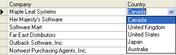
The drop-down combo box contains one item for each member of the ValueItemCollection object. If the collection's Translate property is True, then the DisplayValue text is used for the combo box items; if it is False, then the Value text is used.
True DBGrid for WinForms automatically sizes the drop-down combo box to fit the width of the column in which it is displayed. The height of the combo box is determined by the number of items in the collection and the MaxComboItems property. If the number of items is less than or equal to MaxComboItems, which has a default value of 5, and then all value items will be shown. If the number of items exceeds MaxComboItems, only MaxComboItems will be shown, but a scroll bar will appear at the right edge of the combo box to allow users to bring the other items into view.