Accordion allows you to customize its appearance in different ways based on your requirements. It provides various properties which can be used to customize different elements of the Accordion control such as its header, icon and content area. The following sections explain different customizations that can change the appearance of the Accordion control.
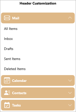
You can customize the header of the Accordion control by modifying the header of the expanders in each accordion pane using HeaderTemplate property of the C1Expander class. This property sets a template for the header using the DataTemplate class.
The following image showcases customized headers of the Expanders used in the Accordion control.
The following code showcases customization of the Expander headers in the Accordion control. This example uses the sample created in Quick Start.
| XAML |
Copy Code
|
|---|---|
<!--Header Customization--> <StackPanel Orientation="Vertical" Grid.Column="0"> <TextBlock Text="Header Customization" FontWeight="Bold" FontSize="14" TextAlignment="Center"></TextBlock> <c1:C1Accordion x:Name="accordion1" Width="300" Margin="25"> <c1:C1Expander Header="Mail" Style="{StaticResource ExpanderStyle}"> <c1:C1Expander.HeaderTemplate> <DataTemplate> <Grid> <Grid.ColumnDefinitions> <ColumnDefinition Width="Auto" /> <ColumnDefinition /> </Grid.ColumnDefinitions> <core:C1PathIcon Data="M0 4a2 2 0 0 1 2-2h12a2 2 0 0 1 2 2v8a2 2 0 0 1-2 2H2a2 2 0 0 1-2-2V4zm2-1a1 1 0 0 0-1 1v.217l7 4.2 7-4.2V4a1 1 0 0 0-1-1H2zm13 2.383-4.758 2.855L15 11.114v-5.73zm-.034 6.878L9.271 8.82 8 9.583 6.728 8.82l-5.694 3.44A1 1 0 0 0 2 13h12a1 1 0 0 0 .966-.739zM1 11.114l4.758-2.876L1 5.383v5.73z" Width="24" Height="24" Margin="4"/> <TextBlock Text="Mail" Grid.Column="1" VerticalAlignment="Center" Margin="4"/> </Grid> </DataTemplate> </c1:C1Expander.HeaderTemplate> <ListView> <ListViewItem Content="All Items"/> <ListViewItem Content="Inbox"/> <ListViewItem Content="Drafts"/> <ListViewItem Content="Sent Items"/> <ListViewItem Content="Deleted Items"/> </ListView> </c1:C1Expander> <c1:C1Expander Header="Calendar" Style="{StaticResource ExpanderStyle}"> <c1:C1Expander.HeaderTemplate> <DataTemplate> <Grid> <Grid.ColumnDefinitions> <ColumnDefinition Width="Auto" /> <ColumnDefinition /> </Grid.ColumnDefinitions> <core:C1PathIcon Data="M14 0H2a2 2 0 0 0-2 2v12a2 2 0 0 0 2 2h12a2 2 0 0 0 2-2V2a2 2 0 0 0-2-2zM1 3.857C1 3.384 1.448 3 2 3h12c.552 0 1 .384 1 .857v10.286c0 .473-.448.857-1 .857H2c-.552 0-1-.384-1-.857V3.857z M6.5 7a1 1 0 1 0 0-2 1 1 0 0 0 0 2zm3 0a1 1 0 1 0 0-2 1 1 0 0 0 0 2zm3 0a1 1 0 1 0 0-2 1 1 0 0 0 0 2zm-9 3a1 1 0 1 0 0-2 1 1 0 0 0 0 2zm3 0a1 1 0 1 0 0-2 1 1 0 0 0 0 2zm3 0a1 1 0 1 0 0-2 1 1 0 0 0 0 2zm3 0a1 1 0 1 0 0-2 1 1 0 0 0 0 2zm-9 3a1 1 0 1 0 0-2 1 1 0 0 0 0 2zm3 0a1 1 0 1 0 0-2 1 1 0 0 0 0 2zm3 0a1 1 0 1 0 0-2 1 1 0 0 0 0 2z" Width="24" Height="24" Margin="4"/> <TextBlock Text="Calendar" Grid.Column="1" VerticalAlignment="Center" Margin="4"/> </Grid> </DataTemplate> </c1:C1Expander.HeaderTemplate> <calendar:C1Calendar Background="Beige" VerticalAlignment="Top" DayOfWeekFormat="d" Margin="4"/> </c1:C1Expander> <c1:C1Expander Header="Contacts" Style="{StaticResource ExpanderStyle}"> <c1:C1Expander.HeaderTemplate> <DataTemplate> <Grid> <Grid.ColumnDefinitions> <ColumnDefinition Width="Auto" /> <ColumnDefinition /> </Grid.ColumnDefinitions> <core:C1PathIcon Data="M6 8a3 3 0 1 0 0-6 3 3 0 0 0 0 6zm-5 6s-1 0-1-1 1-4 6-4 6 3 6 4-1 1-1 1H1zM11 3.5a.5.5 0 0 1 .5-.5h4a.5.5 0 0 1 0 1h-4a.5.5 0 0 1-.5-.5zm.5 2.5a.5.5 0 0 0 0 1h4a.5.5 0 0 0 0-1h-4zm2 3a.5.5 0 0 0 0 1h2a.5.5 0 0 0 0-1h-2zm0 3a.5.5 0 0 0 0 1h2a.5.5 0 0 0 0-1h-2z" Width="24" Height="24" Margin="4"/> <TextBlock Text="Contacts" Grid.Column="1" VerticalAlignment="Center" Margin="4"/> </Grid> </DataTemplate> </c1:C1Expander.HeaderTemplate> <ListView> <ListViewItem Content="John Smith"/> <ListViewItem Content="Bob Martin"/> <ListViewItem Content="Ricky Dylan"/> <ListViewItem Content="Joey Martin"/> <ListViewItem Content="James Geller"/> </ListView> </c1:C1Expander> <c1:C1Expander Header="Tasks" Style="{StaticResource ExpanderStyle}"> <c1:C1Expander.HeaderTemplate> <DataTemplate> <Grid> <Grid.ColumnDefinitions> <ColumnDefinition Width="Auto" /> <ColumnDefinition /> </Grid.ColumnDefinitions> <core:C1PathIcon Data="M19,19H5V8H19M19,3H18V1H16V3H8V1H6V3H5C3.89,3 3,3.9 3,5V19A2,2 0 0,0 5,21H19A2,2 0 0,0 21,19V5A2,2 0 0,0 19,3M16.53,11.06L15.47,10L10.59,14.88L8.47,12.76L7.41,13.82L10.59,17L16.53,11.06Z" Width="24" Height="24" Margin="4"/> <TextBlock Text="Tasks" Grid.Column="1" VerticalAlignment="Center" Margin="4"/> </Grid> </DataTemplate> </c1:C1Expander.HeaderTemplate> <ListView> <ListViewItem Content="All Tasks"/> <ListViewItem Content="Completed Tasks"/> <ListViewItem Content="Active Tasks"/> <ListViewItem Content="Overdue Tasks"/> <ListViewItem Content="Halted Tasks"/> </ListView> </c1:C1Expander> </c1:C1Accordion> </StackPanel> |
|
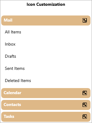
Accordion allows you to customize its expand/collapse icon. It provides you the ExpandIconTemplate property in the C1Accordion class which can be used to set and customize the template for the expand icon in the Accordion control. The ExpandIconTemplate property uses the DataTemplate class to customize the template of the expand icon. The following image displays a custom icon used in the Accordion control for depicting the expand icons.
The following code demonstrates how to customize the expand icons of the accordion control and add image for the expand icon. This example uses the sample created in Quick Start.
| XAML |
Copy Code
|
|---|---|
<!--Icon Customization--> <StackPanel Orientation="Vertical" Grid.Column="1"> <TextBlock Text="Icon Customization" FontWeight="Bold" FontSize="14" TextAlignment="Center"></TextBlock> <c1:C1Accordion x:Name="accordion2" Width="300" Margin="25"> <c1:C1Accordion.ExpandIconTemplate> <DataTemplate> <Image Source="\IconImages\expandicon.ico" Height="15" Width="15"></Image> </DataTemplate> </c1:C1Accordion.ExpandIconTemplate> <c1:C1Expander Header="Mail" Style="{StaticResource ExpanderStyle}"> <ListView> <ListViewItem Content="All Items"/> <ListViewItem Content="Inbox"/> <ListViewItem Content="Drafts"/> <ListViewItem Content="Sent Items"/> <ListViewItem Content="Deleted Items"/> </ListView> </c1:C1Expander> <c1:C1Expander Header="Calendar" Style="{StaticResource ExpanderStyle}"> <calendar:C1Calendar Background="Beige" VerticalAlignment="Top" DayOfWeekFormat="d" Margin="4"/> </c1:C1Expander> <c1:C1Expander Header="Contacts" Style="{StaticResource ExpanderStyle}"> <ListView> <ListViewItem Content="John Smith"/> <ListViewItem Content="Bob Martin"/> <ListViewItem Content="Ricky Dylan"/> <ListViewItem Content="Joey Martin"/> <ListViewItem Content="James Geller"/> </ListView> </c1:C1Expander> <c1:C1Expander Header="Tasks" Style="{StaticResource ExpanderStyle}"> <ListView> <ListViewItem Content="All Tasks"/> <ListViewItem Content="Completed Tasks"/> <ListViewItem Content="Active Tasks"/> <ListViewItem Content="Overdue Tasks"/> <ListViewItem Content="Halted Tasks"/> </ListView> </c1:C1Expander> </c1:C1Accordion> </StackPanel> |
|
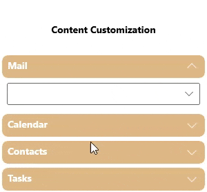
You can customize the content used in the content area of the Accordion control. You can add a variety of controls or items, such as ComboBox, CheckBox, Slider, Button etc., in the expanders added to the content area to customize the content of the Accordion control.
The following GIF showcases a ComboBox to populate data within one of the Expander control used in the content area of the Accordion control.
The following code demonstrates how you can add a ComboBox control to the Expander in the Accordion control. This example uses the sample created in Quick Start.
| XAML |
Copy Code
|
|---|---|
<!--Content Customization--> <StackPanel Orientation="Vertical" Grid.Column="2"> <TextBlock Text="Content Customization" FontWeight="Bold" FontSize="14" TextAlignment="Center"></TextBlock> <c1:C1Accordion x:Name="accordion3" Width="300" Margin="25"> <c1:C1Expander Header="Mail" Style="{StaticResource ExpanderStyle}"> <ComboBox Margin="7" Width="280"> <ComboBoxItem>All Items</ComboBoxItem> <ComboBoxItem>Inbox</ComboBoxItem> <ComboBoxItem>Drafts</ComboBoxItem> <ComboBoxItem>Sent Items</ComboBoxItem> <ComboBoxItem>Deleted Items</ComboBoxItem> </ComboBox> </c1:C1Expander> <c1:C1Expander Header="Calendar" Style="{StaticResource ExpanderStyle}"> <calendar:C1Calendar Background="Beige" VerticalAlignment="Top" DayOfWeekFormat="d" Margin="4"/> </c1:C1Expander> <c1:C1Expander Header="Contacts" Style="{StaticResource ExpanderStyle}"> <ListView> <ListViewItem Content="John Smith"/> <ListViewItem Content="Bob Martin"/> <ListViewItem Content="Ricky Dylan"/> <ListViewItem Content="Joey Martin"/> <ListViewItem Content="James Geller"/> </ListView> </c1:C1Expander> <c1:C1Expander Header="Tasks" Style="{StaticResource ExpanderStyle}"> <ListView> <ListViewItem Content="All Tasks"/> <ListViewItem Content="Completed Tasks"/> <ListViewItem Content="Active Tasks"/> <ListViewItem Content="Overdue Tasks"/> <ListViewItem Content="Halted Tasks"/> </ListView> </c1:C1Expander> </c1:C1Accordion> </StackPanel> |
|
Accordion allows you to specify whether the expanded item should fill the empty area in the control using Fill property of the C1Accordion class. The following GIF displays how the Accordion control behaves when the Fill property is set to True.

The following code demonstrates how to fill the empty area in the Accordion control. This example uses the sample created in Quick Start.
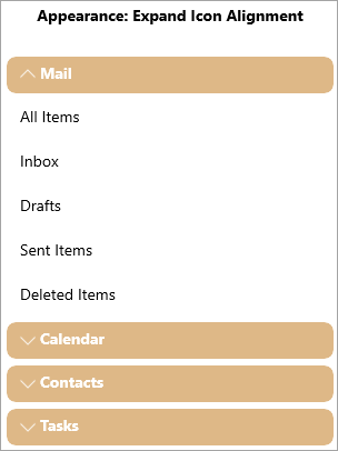
Expand Icon appears next to the header which when clicked expands the content area of the Accordion control. By default, the expand icon is aligned on the right side of the header. However, you can change the alignment of the expand icon as per your requirements using ExpandIconAlignment property of the C1Accordion class. The ExpandIconAlignment property changes the alignment of the expand icon using the ExpanderIconAlignment enumeration.
The following image shows the expand icon aligned on the left of the header of the Accordion control.
The following code shows how you can change the alignment of the expand icon to "Left". This example uses the sample created in Quick Start.
| XAML |
Copy Code
|
|---|---|
<!--Appearance: Expand Icon Alignment--> <StackPanel Orientation="Vertical" Grid.Column="2"> <TextBlock Text="Appearance: Expand Icon Alignment" FontWeight="Bold" FontSize="14" TextAlignment="Center"></TextBlock> <c1:C1Accordion x:Name="accordion3" ExpandIconAlignment="Left" Width="300" Margin="25"> <c1:C1Expander Header="Mail" Style="{StaticResource ExpanderStyle}"> <ListView> <ListViewItem Content="All Items"/> <ListViewItem Content="Inbox"/> <ListViewItem Content="Drafts"/> <ListViewItem Content="Sent Items"/> <ListViewItem Content="Deleted Items"/> </ListView> </c1:C1Expander> <c1:C1Expander Header="Calendar" Style="{StaticResource ExpanderStyle}"> <calendar:C1Calendar Background="Beige" VerticalAlignment="Top" DayOfWeekFormat="d" Margin="4"/> </c1:C1Expander> <c1:C1Expander Header="Contacts" Style="{StaticResource ExpanderStyle}"> <ListView> <ListViewItem Content="John Smith"/> <ListViewItem Content="Bob Martin"/> <ListViewItem Content="Ricky Dylan"/> <ListViewItem Content="Joey Martin"/> <ListViewItem Content="James Geller"/> </ListView> </c1:C1Expander> <c1:C1Expander Header="Tasks" Style="{StaticResource ExpanderStyle}"> <ListView> <ListViewItem Content="All Tasks"/> <ListViewItem Content="Completed Tasks"/> <ListViewItem Content="Active Tasks"/> <ListViewItem Content="Overdue Tasks"/> <ListViewItem Content="Halted Tasks"/> </ListView> </c1:C1Expander> </c1:C1Accordion> </StackPanel> |
|