Accordion provides various options to style the UI and change the look and feel of the control. The C1Accordion class provides several properties which offer different ways of styling the elements of the Accordion control, such as header and expand icon. Let us explore about styling the header and expand icon in the following sections.
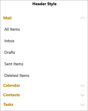
Accordion allows you to apply styles to it's header element. It provides HeaderStyle property in the C1Accordion class which applies style to the header of the Accordion control as demonstrated in the following image.
The following code applies style to the Accordion control's header. This example uses the sample created in Quick Start.
| XAML |
Copy Code
|
|---|---|
<!--Header Style--> <StackPanel Orientation="Vertical" Grid.Column="0"> <TextBlock Text="Header Style" FontWeight="Bold" FontSize="14" TextAlignment="Center"></TextBlock> <c1:C1Accordion x:Name="accordion1" Width="300" Margin="25"> <c1:C1Accordion.HeaderStyle> <Style TargetType="ContentControl"> <Setter Property="Foreground" Value="DarkGoldenrod"></Setter> <Setter Property="FontWeight" Value="Bold"></Setter> <Setter Property="FontFamily" Value="segoe ui"></Setter> </Style> </c1:C1Accordion.HeaderStyle> <c1:C1Expander Header="Mail"> <ListView> <ListViewItem Content="All Items"/> <ListViewItem Content="Inbox"/> <ListViewItem Content="Drafts"/> <ListViewItem Content="Sent Items"/> <ListViewItem Content="Deleted Items"/> </ListView> </c1:C1Expander> <c1:C1Expander Header="Calendar"> <calendar:C1Calendar Background="Beige" VerticalAlignment="Top" DayOfWeekFormat="d" Margin="4"/> </c1:C1Expander> <c1:C1Expander Header="Contacts"> <ListView> <ListViewItem Content="John Smith"/> <ListViewItem Content="Bob Martin"/> <ListViewItem Content="Ricky Dylan"/> <ListViewItem Content="Joey Martin"/> <ListViewItem Content="James Geller"/> </ListView> </c1:C1Expander> <c1:C1Expander Header="Tasks"> <ListView> <ListViewItem Content="All Tasks"/> <ListViewItem Content="Completed Tasks"/> <ListViewItem Content="Active Tasks"/> <ListViewItem Content="Overdue Tasks"/> <ListViewItem Content="Halted Tasks"/> </ListView> </c1:C1Expander> </c1:C1Accordion> </StackPanel> |
|
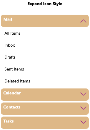
In addition to styling the header, Accordion also lets you style its expand icon. It allows you to apply style to the expand icon of the Accordion control using the ExpandIconStyle property.
The following code applies style to the expand icon of the Accordion control. This example uses the sample created in Quick Start.
| XAML |
Copy Code
|
|---|---|
<!--Expand Icon Style--> <StackPanel Orientation="Vertical" Grid.Column="1"> <TextBlock Text="Expand Icon Style" FontWeight="Bold" FontSize="14" TextAlignment="Center"></TextBlock> <c1:C1Accordion x:Name="accordion2" Width="300" Margin="25"> <c1:C1Accordion.ExpandIconStyle> <Style TargetType="ContentControl"> <Setter Property="Height" Value="30"></Setter> <Setter Property="Width" Value="20"></Setter> <Setter Property="Foreground" Value="DarkMagenta"></Setter> </Style> </c1:C1Accordion.ExpandIconStyle> <c1:C1Expander Header="Mail" Style="{StaticResource ExpanderStyle}"> <ListView> <ListViewItem Content="All Items"/> <ListViewItem Content="Inbox"/> <ListViewItem Content="Drafts"/> <ListViewItem Content="Sent Items"/> <ListViewItem Content="Deleted Items"/> </ListView> </c1:C1Expander> <c1:C1Expander Header="Calendar" Style="{StaticResource ExpanderStyle}"> <calendar:C1Calendar Background="Beige" VerticalAlignment="Top" DayOfWeekFormat="d" Margin="4"/> </c1:C1Expander> <c1:C1Expander Header="Contacts" Style="{StaticResource ExpanderStyle}"> <ListView> <ListViewItem Content="John Smith"/> <ListViewItem Content="Bob Martin"/> <ListViewItem Content="Ricky Dylan"/> <ListViewItem Content="Joey Martin"/> <ListViewItem Content="James Geller"/> </ListView> </c1:C1Expander> <c1:C1Expander Header="Tasks" Style="{StaticResource ExpanderStyle}"> <ListView> <ListViewItem Content="All Tasks"/> <ListViewItem Content="Completed Tasks"/> <ListViewItem Content="Active Tasks"/> <ListViewItem Content="Overdue Tasks"/> <ListViewItem Content="Halted Tasks"/> </ListView> </c1:C1Expander> </c1:C1Accordion> </StackPanel> |
|