The FlexGrid control lets you customize the border of grid, row, column and even cells by changing its style, color direction and so on.
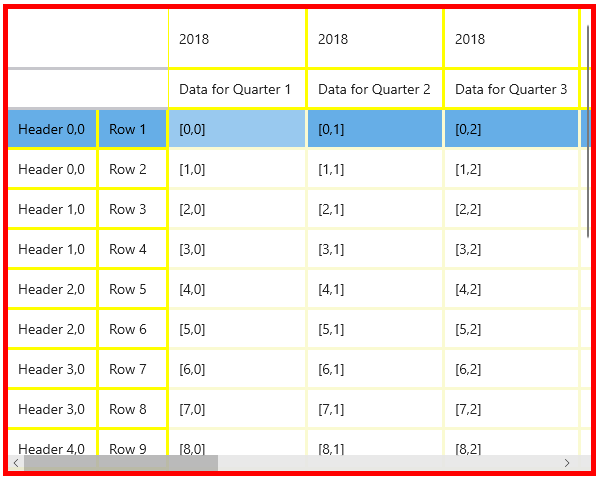
FlexGrid lets you customize the border style of the control. Since control borders are like grid borders, you can customize the borders of the grid.
Following code shows how to customize border of the FlexGrid control using BorderBrush property.
| C# |
Copy Code
|
|---|---|
// Customize Control Border // same as Grid borders //Customize Grid Borders flexGrid1.ShowOutlineBar = true; flexGrid1.BorderBrush = new SolidColorBrush(Colors.Red); flexGrid1.BorderThickness = new Thickness(5, 5, 5, 5); |
|
FlexGrid lets you customize the border style of a particular row or column. Since Row and column borders are like gridlines, hence you can set Gridlines Styles.
Use the below code to change border of rows or columns of the FlexGrid using GridLinesBrush property.
| C# |
Copy Code
|
|---|---|
flexGrid1.GridLinesVisibility = GridLinesVisibility.All; flexGrid1.GridLinesBrush = new SolidColorBrush(Colors.LightGoldenrodYellow); flexGrid1.GridLinesWidth = 3; flexGrid1.ColumnHeaderGridLinesVisibility = GridLinesVisibility.All; flexGrid1.RowHeaderGridLinesVisibility = GridLinesVisibility.All; flexGrid1.ColumnHeaderGridLinesBrush = new SolidColorBrush(Colors.Yellow); flexGrid1.RowHeaderGridLinesBrush = new SolidColorBrush(Colors.Yellow); |
|