FlexGrid provides an ability to style the cell in an easier way. FlexGrid also lets you customize overall look of the cell within the grid, not to just increase its aesthetic value but also increases its readability. For instance, you can change the background and foreground of cells.
The following image shows styling applied on grid cells.
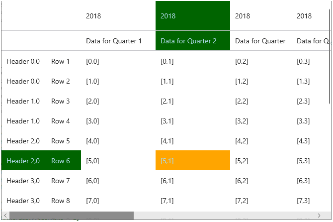
FlexGrid lets you set the brush to paint the selected cell background, foreground, selected row header background/foreground and selected column header background/foreground.
The following code illustrates customizing selected cells.
| C# |
Copy Code
|
|---|---|
// Customize Selected Cell flexGrid1.SelectionMode = GridSelectionMode.Cell; flexGrid1.SelectionBackground = new SolidColorBrush(Colors.Orange); flexGrid1.SelectionForeground = new SolidColorBrush(Colors.LightBlue); flexGrid1.RowHeaderSelectedBackground = new SolidColorBrush(Colors.DarkGreen); flexGrid1.RowHeaderSelectedForeground = new SolidColorBrush(Colors.LightBlue); flexGrid1.ColumnHeaderSelectedBackground = new SolidColorBrush(Colors.DarkGreen); flexGrid1.ColumnHeaderSelectedForeground = new SolidColorBrush(Colors.LightBlue); |
|