Data labels are the labels associated with the data points, generally, displaying the value of those data points. They are especially useful in the charts where it is difficult to know the exact value of data points by simply looking at them.
|
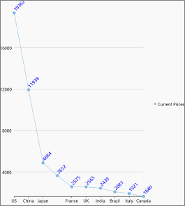
Data Labels in Line Symbols Chart |
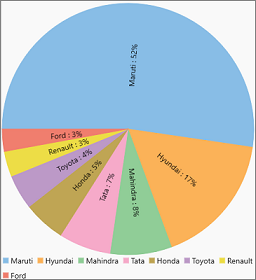
Data Labels in Pie Chart |
|---|---|
|
|
|
In FlexChart, data labels can be displayed by setting the DataLabel property which is of type DataLabel class. You can set the Content property of the DataLabel class to specify what to display in the data labels.
| CS |
Copy Code
|
|---|---|
flexChart.DataLabel.Content = "{value}";
|
|
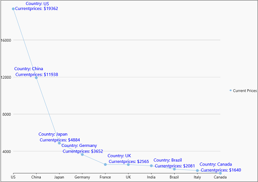
FlexChart allows you to create custom data labels by assigning a template string to the Content property. You can use the following pre-defined parameters to create the template strings.FlexChart also allows you to format the values to be displayed in the data label. For instance, you can format the sales or expenses figures by using the required currency, separators or even number of decimal places. You can also use the various date formats, long and short, to display the values of time series.
| CS |
Copy Code
|
|---|---|
//Set template string to create custom content for data labels this.flexChart.DataLabel.Content = "Country: {x} \n Currentprices: ${y}"; |
|
FlexChart allows you to specify where to display the data labels with respect to the data point using the Position property. This property accepts the values from C1.Chart.LabelPosition enumeration which allows you to position the data labels towards the top, bottom, center, left or right of the data point. In case of pie chart and sunburst chart, positioning of data labels can be done through the Position property of PieDataLabel class which accepts values from PieLabelPosition enumeration. This property lets you position the data labels towards inside, outside or in the center of the chart. You can also display the data labels in circular or radial direction inside the charts using the same property. The default value of both of the abovementioned properties is Auto, which, automatically positions the data labels according to the available space on the chart. You also have option to set this value to None to hide the data labels.
| CS |
Copy Code
|
|---|---|
flexChart.DataLabel.Position = C1.Chart.LabelPosition.Top; |
|
FlexChart provides various other properties related to data labels which can contribute to the overall appearance and clear understanding of the chart. For instance, to make it clear which data label belongs to a particular data point in a data packed chart, FlexChart allows you to display a connecting line by setting the ConnectingLine property to true. You can also set an offset to define how far a data label should appear from the data point. Moreover, FlexChart also lets you display the data labels with borders by setting the Border property to true. You can even style the border using the BorderStyle property so that the data labels stand out against the chart background. Another property which helps improve the visibility of the data labels is the Angle property which can be set to a value from 0 to 90 degrees. This also helps in avoiding the overlapping data labels.
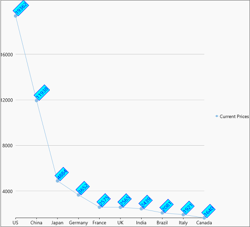
The following code demonstrates the styling applied on the data labels with top position and 45 degree rotational angle.
| CS |
Copy Code
|
|---|---|
//Set to show data labels borders this.flexChart.DataLabel.Border = true; //set angle flexChart.DataLabel.Angle = 45; //Set style flexChart.DataLabel.Style = new C1.WinUI.Chart.ChartStyle() { Stroke = new SolidColorBrush(Windows.UI.Color.FromArgb(255, 0, 0, 255)), FontSize = 16, Fill = new SolidColorBrush(Windows.UI.Color.FromArgb(255, 0, 255, 255)) }; |
|