The Expander control comprises three elements – the header, the expand icon and the content area. Let us get into the visual and descriptive overview of the elements that comprise the complete Expander control.
The Expander control looks similar to the image below:
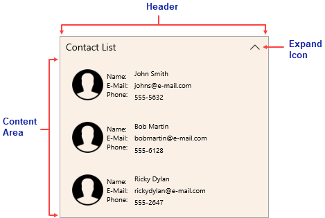
The description of these elements is as follows: