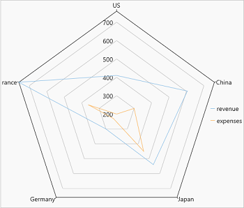
Radar charts are radial charts that help in visualizing comparison of two or more groups of values against various features or characteristics. These charts represent each variable on a separate axis which are arranged radially around a center at equal distances from each other. Each of these axes share the same tick marks and scale. The data for each observation is plotted along these axis and then joined to form a polygon. Multiple observations, that is, polygons plotted on a chart are also a great way to identify the outliers among each variable. Radar charts are generally used for analyzing performance or comparing values such as revenue and expense as shown in the image below.
FlexChart provides radar chart through a stand alone control which is represented by the FlexRadar class. To create a radar chart through code, the first step after initializing the control is to configure the X axis (radial axis) by setting the BindingX property. Then, add new series and set the Binding property for each added series as demonstrated in the following code:
| XAML |
Copy Code
|
|---|---|
<c1:FlexRadar x:Name="flexRadar" Height="650" BindingX="Name"> <c1:Series Binding="Sales" SeriesName="revenue"/> <c1:Series Binding="Expenses" SeriesName="expenses"/> </c1:FlexRadar> |
|
Following C# code sets up the data using ItemsSource property and uses a custom method named GetCountrySales to supply data to the chart. This code uses the same datasource which is used in Quick Start. You can set up the data source as per your requirements.
| C# |
Copy Code
|
|---|---|
flexRadar.ItemsSource = DataService.GetCountrySales(); |
|