The following quick start guides the user how to create a simple application using Accordion. In this quick start, you'll create a new project in Visual Studio, add the Accordion control to your application, and then add content to content area of the Accordion control.
| XAML |
Copy Code
|
|---|---|
<Window x:Class="Accordion_quickstart.MainWindow" xmlns="http://schemas.microsoft.com/winfx/2006/xaml/presentation" xmlns:x="http://schemas.microsoft.com/winfx/2006/xaml" xmlns:d="http://schemas.microsoft.com/expression/blend/2008" xmlns:mc="http://schemas.openxmlformats.org/markup-compatibility/2006" xmlns:local="clr-namespace:Accordion_quickstart" xmlns:c1="http://schemas.componentone.com/winfx/2006/xaml" mc:Ignorable="d" Title="MainWindow" Height="450" Width="800"> <Grid> </Grid> </Window> |
|
| XAML |
Copy Code
|
|---|---|
```` <Grid> <c1:C1Accordion></c1:C1Accordion> </Grid> ```` |
|
| XAML |
Copy Code
|
|---|---|
<!--Add first Expander control in Accordion pane.--> <c1:C1Expander Header="Mail" IsExpanded="True"> </c1:C1Expander> |
|
Add items to the Expander, such as ListBox, Image and TextBlock controls as shown below:
| XAML |
Copy Code
|
|---|---|
<!--Add listbox items within Expander control.-->
                <ListBox>
                    <ListBoxItem>
                        <Grid>
                            <Image  Source="/Folder.png" HorizontalAlignment="Left" />
                            <TextBlock HorizontalAlignment="Left" VerticalAlignment="Top" Text="All Items" TextWrapping="Wrap" Margin="16,0,0,0" Width="60" />
                        </Grid>
                    </ListBoxItem>
                    <ListBoxItem FontWeight="Bold" FontFamily="Portable User Interface">
                        <Grid>
                            <Image  Source="/Folder.png" HorizontalAlignment="Left" />
                            <TextBlock HorizontalAlignment="Left" VerticalAlignment="Top" Text="Inbox (1)" TextWrapping="Wrap" Margin="16,0,0,0" Width="60" />
                        </Grid>
                    </ListBoxItem>
                    <ListBoxItem>
                        <Grid>
                            <Image Source="/Folder.png" HorizontalAlignment="Left" />
                            <TextBlock HorizontalAlignment="Left" VerticalAlignment="Top" Text="Drafts" TextWrapping="Wrap" Margin="16,0,0,0" Width="60" />
                        </Grid>
                    </ListBoxItem>
                    <ListBoxItem>
                        <Grid>
                            <Image  Source="/Folder.png" HorizontalAlignment="Left" />
                            <TextBlock HorizontalAlignment="Left" VerticalAlignment="Top" Text="Sent Items" TextWrapping="Wrap" Margin="16,0,0,0" Width="65" />
                        </Grid>
                    </ListBoxItem>
                    <ListViewItem>
                        <Grid>
                            <Image  Source="/Folder.png" HorizontalAlignment="Left" />
                            <TextBlock HorizontalAlignment="Left" VerticalAlignment="Top" Text="Trash" TextWrapping="Wrap" Margin="16,0,0,0" Width="60" />
                        </Grid>
                    </ListViewItem>
                </ListBox>
|
|
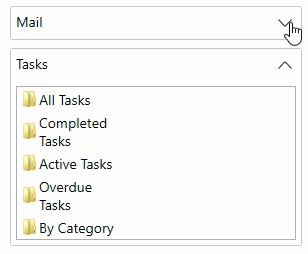
Add the second Expander to fill the Accordion pane.
| XAML |
Copy Code
|
|---|---|
<!--Add second Expander control in Accordion pane.--> <c1:C1Expander Header="Tasks" IsExpanded="False"> <!--Add listbox items within Expander control.--> <ListBox> <ListBoxItem> <Grid> <Image Source="/Folder.png" HorizontalAlignment="Left" /> <TextBlock HorizontalAlignment="Left" VerticalAlignment="Top" Text="All Tasks" TextWrapping="Wrap" Margin="16,0,0,0" Width="60" /> </Grid> </ListBoxItem> <ListBoxItem> <Grid> <Image Source="/Folder.png" HorizontalAlignment="Left" /> <TextBlock HorizontalAlignment="Left" VerticalAlignment="Top" Text="Completed Tasks" TextWrapping="Wrap" Margin="16,0,0,0" Width="94.724" /> </Grid> </ListBoxItem> <ListBoxItem> <Grid> <Image Source="/Folder.png" HorizontalAlignment="Left" /> <TextBlock HorizontalAlignment="Left" VerticalAlignment="Top" Text="Active Tasks" TextWrapping="Wrap" Margin="16,0,0,0" Width="87.324" /> </Grid> </ListBoxItem> <ListBoxItem> <Grid> <Image Source="/Folder.png" HorizontalAlignment="Left" /> <TextBlock HorizontalAlignment="Left" VerticalAlignment="Top" Text="Overdue Tasks" TextWrapping="Wrap" Margin="16,0,0,0" Width="88.462" /> </Grid> </ListBoxItem> <ListBoxItem> <Grid> <Image Source="/Folder.png" HorizontalAlignment="Left" /> <TextBlock HorizontalAlignment="Left" VerticalAlignment="Top" Text="By Category" TextWrapping="Wrap" Margin="16,0,0,0" Width="75" /> </Grid> </ListBoxItem> </ListBox> </c1:C1Expander> |
|