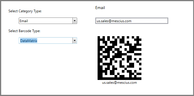
This quick start guides you through the steps of adding the BarCode control in a WPF application. The image snapshot below is based on the use case where an application takes two types of inputs, product category and barcode type to generate a resulting barcode output. The application is designed such that the items in the Select Barcode Type combo box is populated on the basis of the value selected in the Select Category type combo box. This is because the Barcode control features selective encoding, therefore, some barcodes do not encode certain input values. That is, for example, the text category can be supported by all types of Barcodes, however QRCodes, DataMatrix, Pdf417 and Code39x support other value types like URL, Email and VfCard.
| XAML |
Copy Code
|
|---|---|
<Window x:Class="BarCodeSample.MainWindow" xmlns="http://schemas.microsoft.com/winfx/2006/xaml/presentation" xmlns:x="http://schemas.microsoft.com/winfx/2006/xaml" xmlns:d="http://schemas.microsoft.com/expression/blend/2008" xmlns:mc="http://schemas.openxmlformats.org/markup-compatibility/2006" xmlns:local="clr-namespace:BarCodeSample" xmlns:c1="http://schemas.componentone.com/winfx/2006/xaml" mc:Ignorable="d" xmlns:demo="clr-namespace:BarCodeSample.Editor" Title="Bar Code" HorizontalAlignment="Center" BorderBrush="DarkGray" BorderThickness="10" Height="430" Width="900"> </Window> <Window.DataContext> <local:BarCodeViewModel/> </Window.DataContext> <Window.Resources> <BooleanToVisibilityConverter x:Key="imgV"/> </Window.Resources> |
|
| XAML |
Copy Code
|
|---|---|
<Grid Margin="10"> <Grid.ColumnDefinitions> <ColumnDefinition Width="300" /> <ColumnDefinition Width="300"/> <ColumnDefinition Width="300"/> <ColumnDefinition /> </Grid.ColumnDefinitions> </Grid> |
|
| XAML |
Copy Code
|
|---|---|
<StackPanel Orientation="Vertical" Margin="10"> <TextBlock Text="Select Category Type:" Margin="5" VerticalAlignment="Center" /> <c1:C1ComboBox ItemsSource="{Binding Categories,UpdateSourceTrigger=PropertyChanged,Mode=TwoWay}" x:Name="CategoryType" IsEditable="False" SelectedItem="{Binding CategoriesChanged,UpdateSourceTrigger=PropertyChanged,Mode=TwoWay}" Width="200" Margin="10" /> <TextBlock Text="Select Barcode Type:" Margin="5" VerticalAlignment="Center" /> <c1:C1ComboBox IsEnabled="{Binding IsBarCodeTypeEnabled,UpdateSourceTrigger=PropertyChanged,Mode=TwoWay}" ItemsSource="{Binding Barcodes,UpdateSourceTrigger=PropertyChanged,Mode=TwoWay}" x:Name="BarcodeType" IsEditable="False" SelectedItem="{Binding BarcodesChanged,UpdateSourceTrigger=PropertyChanged,Mode=TwoWay}" Width="200" Margin="10" /> </StackPanel> <StackPanel Grid.Column="1" Margin="10,0,0,0"> <StackPanel Margin="2" HorizontalAlignment="Left" Visibility="{Binding IsEmailView,UpdateSourceTrigger=PropertyChanged,Mode=TwoWay,Converter={StaticResource imgV}}"> <TextBlock Text="Email" Foreground="Black" FontSize="14" HorizontalAlignment="Left"/> <TextBox Margin="0,25,0,0" x:Name="txt" Text="{Binding Email, UpdateSourceTrigger=PropertyChanged,Mode=TwoWay}" MinWidth="250" BorderThickness="3" HorizontalAlignment="Left"/> </StackPanel> <StackPanel Margin="2" HorizontalAlignment="Left" Visibility="{Binding IsTextView,UpdateSourceTrigger=PropertyChanged,Mode=TwoWay,Converter={StaticResource imgV}}"> <TextBlock Text="Text" Foreground="Black" FontSize="14" HorizontalAlignment="Left"/> <TextBox Margin="0,25,0,0" Text="{Binding Text, UpdateSourceTrigger=PropertyChanged,Mode=TwoWay}" MinWidth="250" BorderThickness="3" HorizontalAlignment="Left"/> </StackPanel> <StackPanel Margin="2" HorizontalAlignment="Left" Visibility="{Binding IsUrlView,UpdateSourceTrigger=PropertyChanged,Mode=TwoWay,Converter={StaticResource imgV}}"> <TextBlock Text="Url" Foreground="Black" FontSize="14" HorizontalAlignment="Left"/> <TextBox Margin="0,25,0,0" Text="{Binding Url, UpdateSourceTrigger=PropertyChanged,Mode=TwoWay}" MinWidth="250" BorderThickness="3" HorizontalAlignment="Left"/> </StackPanel> <ScrollViewer MaxHeight="300" HorizontalScrollBarVisibility="Visible" Visibility="{Binding IsVcardView,UpdateSourceTrigger=PropertyChanged,Mode=TwoWay,Converter={StaticResource imgV}}"> <StackPanel> <StackPanel> <TextBlock Text="Name"/> <TextBox Text="{Binding Name, Mode=TwoWay, UpdateSourceTrigger=PropertyChanged}"/> </StackPanel> <StackPanel> <TextBlock Text="Organization"/> <TextBox Text="{Binding Organization, Mode=TwoWay, UpdateSourceTrigger=PropertyChanged}"/> </StackPanel> <StackPanel> <TextBlock Text="Address"/> <TextBox Text="{Binding Address, Mode=TwoWay, UpdateSourceTrigger=PropertyChanged}"/> </StackPanel> <StackPanel> <TextBlock Text="Zip"/> <TextBox Text="{Binding Zip, Mode=TwoWay, UpdateSourceTrigger=PropertyChanged}"/> </StackPanel> <StackPanel> <TextBlock Text="Country"/> <TextBox Text="{Binding Country, Mode=TwoWay, UpdateSourceTrigger=PropertyChanged}"/> </StackPanel> <StackPanel> <TextBlock Text="HomePhone"/> <TextBox Text="{Binding HomePhone, Mode=TwoWay, UpdateSourceTrigger=PropertyChanged}"/> </StackPanel> <StackPanel> <TextBlock Text="Fax"/> <TextBox Text="{Binding Fax, Mode=TwoWay, UpdateSourceTrigger=PropertyChanged}"/> </StackPanel> </StackPanel> </ScrollViewer> <c1:C1BarCode Panel.ZIndex="0" Width="150" CodeType="{Binding BarCodeType,UpdateSourceTrigger=PropertyChanged,Mode=TwoWay}" Text="{Binding BarCodeText,UpdateSourceTrigger=PropertyChanged,Mode=TwoWay}" x:Name="barCode" Margin="10,40,0,0" CaptionPosition="Below" VerticalAlignment="Top" HorizontalAlignment="Left" /> </StackPanel> |
|