The C1RadialMenu is a control that allows radial organization of elements. The radial menus can be nested to any depth that you desire, and you can add as many items to the radial menu as you need to add.
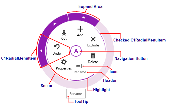
The following image diagrams the elements of the C1RadialMenu control.

The elements of the C1RadialMenu control can be described as follows:
The main radial menu is a circular, top-level context menu control. It is comprised of first-level C1RadialMenuItems and can hold any feature available to C1RadialMenuItems.
Radial menu items are represented by the C1RadialMenuItem class. C1RadialMenuItems can have a Header and an Icon, and you can also set them as Checkable. Each radial menu item might be associated with a Command, which is invoked when the button is pressed. A C1RadialMenuItem that contains child items will also have an Expand Area.
The C1RadialMenu is split into sectors. The C1RadialMenu control will automatically create the sectors based on the number of C1RadialMenuItem your control contains, but you can customize the number of sectors using the SectorCount property.
When a user right taps the application, the Navigation Button will appear. Tap the Navigation Button to show or hide the C1RadialMenu. This button will turn into a back arrow when a user navigates to a submenu.
Using the Icon property, you can customize the icons that appear on your C1RadialMenu.
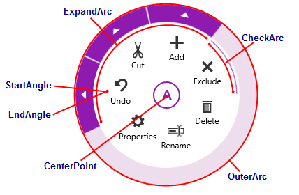
There are a few properties that are used to draw the geometrical paths in the C1RadialMenuItem default control template. By default, these properties are set by the C1RadialPanel, but you can use them to create custom control templates by setting them explicitly in the C1RadialPanel.

The CenterPoint property gets the coordinates of the circle's center. This can be used to draw the circle sector in XAML, representing the current C1RadialMenuItem.
The CheckArc property gets the definition of the check arc segment.
The ExpandArc property gets the definition of the expand area arc segment.
The OuterArc property gets the definition of the outer arc segment. This can be used to draw the circle sector in XAML, representing the current C1RadialMenuItem.
The StartAngle defines the place where the first C1RadialMenuItem should be located. In the sample above, -180 corresponds to 9 o'clock on a clock face. This is the default StartAngle.
The EndAngle defines the place where the last C1RadialMenuItem should be located. In the sample above, 180 corresponds to 9 o'clock on a clock face. This is the default EndAngle.
Starting and ending the sweep of the angle at a similar point ensures that the menu items will be arranged properly around the C1RadialMenu.