In the previous step you created a WPF application or a Silverlight application and added the C1DropDown control to your project. In this step you'll add content to the C1DropDown control. To customize your project and add content to the C1DropDown control in your application, complete the following steps:
XAML
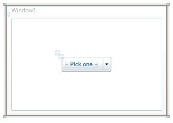
XAML <c1:C1DropDown.Content> <TreeView x:Name="treeSelection" Background="Transparent" Margin="10"> <TreeViewItem Header="South America"> <TreeViewItem Header="Brazil" /> <TreeViewItem Header="Argentina" /> <TreeViewItem Header="Uruguay" /> </TreeViewItem> <TreeViewItem Header="Europe"> <TreeViewItem Header="Italy" /> <TreeViewItem Header="France" /> <TreeViewItem Header="England" /> <TreeViewItem Header="Germany" /> </TreeViewItem> </TreeView> </c1:C1DropDown.Content>This will add a standard TreeView control to the C1DropDown control’s content area. Note that the Window should appear similar to the following image in Design view:
In this step you added content to the C1DropDown control. In the next step you'll further customize the control and run the application to observe run-time interactions.