In the previous steps you created a new WPF or Silverlight project and added a C1HyperPanel panel and several ContentControls to the application. In this step you'll continue by setting properties to customize those controls.
Complete the following steps:
XAML
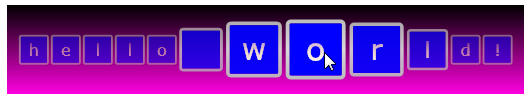
XAML The Distribution property consists of a number between .1 and 1.0 and controls how elements are zoomed near the center of the panel. The smaller the value, the more visible the zoom effect. By default, the property is set to "0.5". Setting Distribution to ".02" will cause elements in the center to appear even more zoomed in then elements at the edge of the panel.
XAML The MinElementScale property consists of a number between 0 and 1.0 and determines how small elements near the edge of the panel will appear when compared to elements near the center. By default, the property is set to "0". Setting MinElementScale will ensure that elements near the edge of the panel will appear half their original size at the smallest.
XAML The Center property consists of a number between 0 and 1.0 and sets where the center, or the most zoomed in element, of the panel is when the application is initially run. By default, the property is set to "0.5" and the center is in the middle. Setting Center will move the initially zoomed element to the left side of the control. This value is updated automatically as the mouse moves over the panel at run time.
XAML <c1:C1HyperPanel.Background> <LinearGradientBrush EndPoint="0.5,1" StartPoint="0.5,0"> <GradientStop Color="#FF000000" Offset="0"/> <GradientStop Color="#FFFF00DF" Offset="1"/> </LinearGradientBrush> </c1:C1HyperPanel.Background>This markup will add a gradient background to the C1HyperPanel.
The application will initially appear similar to the following: