The simplest charts are those in which each data point has a single numeric value associated with it. A typical example would be a chart showing sales data for different regions, similar to the following chart:
Before we can create any charts, we need to generate the data that will be shown as a chart. Here is some code to create the data we need.
| C# |
Copy Code
|
|---|---|
// Simple class to hold dummy sales data public class SalesRecord { // Properties public string Region { get; set; } public string Product { get; set; } public DateTime Date { get; set; } public double Revenue { get; set; } public double Expense { get; set; } public double Profit { get { return Revenue - Expense; } } // Constructor 1 public SalesRecord(string region, double revenue, double expense) { Region = region; Revenue = revenue; Expense = expense; } // Constructor 2 public SalesRecord(DateTime month, string product, double revenue, double expense) { Date = month; Product = product; Revenue = revenue; Expense = expense; } } // Return a list with one SalesRecord for each region List<SalesRecord> GetSalesPerRegionData() { var data = new List<SalesRecord>(); Random rnd = new Random(0); foreach (string region in "North,East,West,South".Split(',')) { data.Add(new SalesRecord(region, 100 + rnd.Next(1500), rnd.Next(500))); } return data; } // Return a list with one SalesRecord for each product,// Over a period of 12 months List<SalesRecord> GetSalesPerMonthData() { var data = new List<SalesRecord>(); Random rnd = new Random(0); string[] products = new string[] {"Widgets", "Gadgets", "Sprockets" }; for (int i = 0; i < 12; i++) { foreach (string product in products) { data.Add(new SalesRecord( DateTime.Today.AddMonths(i - 24), product, rnd.NextDouble() * 1000 * i, rnd.NextDouble() * 1000 * i)); } } return data; } } |
|
Note that the SalesData class is public. This is required for data-binding.
We will follow the following four main steps in creating a chart:
Step 1) Choose the chart type:
The following code clears any existing series, then sets the chart type:
| C# |
Copy Code
|
|---|---|
public Window1() { InitializeComponent(); // Clear current chart c1Chart.Reset(true); // Set chart type c1Chart.ChartType = ChartType.Bar; } |
|
Step 2) Set up the axes:
We will start by obtaining references to both axes. In most charts, the horizontal axis (X) displays labels associated with each point, and the vertical axis (Y) displays the values. The exception is the Bar chart type, which displays horizontal bars. For this chart type, the labels are displayed on the Y axis and the values on the X:
Next we will assign titles to the axes. The axis titles are UIElement objects rather than simple text. This means you have complete flexibility over the format of the titles. In fact, you could use complex elements with buttons, tables, or images for the axis titles. In this case, we will use simple TextBlock elements created by a CreateTextBlock method described later.
We will also configure the value axis to start at zero, and to display the annotations next to the tick marks using thousand separators:
| C# |
Copy Code
|
|---|---|
// configure label axis labelAxis.Title = CreateTextBlock("Region", 14, FontWeights.Bold); // configure value axis _c1Chart.View.AxisX.Title = CreateTextBlock("Amount ($1000)", 14, FontWeights.Bold); c1Chart.View.AxisX.AutoMin = false; c1Chart.View.AxisX.Min = 0; c1Chart.View.AxisX.MajorUnit = 200; c1Chart.View.AxisX.AnnoFormat = "#,##0 "; |
|
Step 3) Add one or more data series
We start this step by retrieving the data using the method listed earlier:
| C# |
Copy Code
|
|---|---|
// get the data var data = GetSalesPerRegionData(); |
|
Next, we want to display the regions along the label axis. To do this, we will use a Linq statement that retrieves the Region property for each record. The result is then converted to an array and assigned to the ItemNames property.
| C# |
Copy Code
|
|---|---|
// Show regions along label axis c1Chart.ChartData.ItemNames = (from r in data select r.Region).ToArray(); |
|
Note how the use of Linq makes the code direct and concise. Things are made even simpler because our sample data contains only one record per region. In a more realistic scenario, there would be several records per region, and we would use a more complex Linq statement to group the data per region.
Now we are ready to create the actual DataSeries objects that will be added to the chart. We will create three series: "Revenue", "Expenses", and "Profit":
| C# |
Copy Code
|
|---|---|
// Add Revenue series var ds = new DataSeries(); ds.Label = "Revenue"; ds.ValuesSource = (from r in data select r.Revenue).ToArray(); c1Chart.Data.Children.Add(ds); // Add Expense series ds = new DataSeries(); ds.Label = "Expense"; ds.ValuesSource = (from r in data select r.Expense).ToArray(); c1Chart.ChartData.Children.Add(ds); // Add Profit series ds = new DataSeries(); ds.Label = "Profit"; ds.ValuesSource = (from r in data select r.Profit).ToArray(); c1Chart.Data.Children.Add(ds); |
|
For each series, the code creates a new DataSeries object, then sets its Label property. The label is optional; if provided, it will be displayed in any C1ChartLegend objects associated with this chart. Next, a Linq statement is used to retrieve the values from the data source. The result is assigned to the ValuesSource property of the data series object. Finally, the data series is added to the chart’s Children collection.
Once again, note how the use of Linq makes the code concise and natural.
Step 4) Adjust the chart’s appearance
We will use the Theme property to quickly configure the chart appearance:
Recall that we used a CreateTextBlock helper method when setting up the axes. Here is the method definition:
| C# |
Copy Code
|
|---|---|
TextBlock CreateTextBlock(string text, double fontSize, FontWeight fontWeight) { var tb = new TextBlock(); tb.Text = text; tb.FontSize = fontSize; tb.FontWeight = fontWeight; return tb; } |
|
This concludes the code that generates simple value charts. You can test it by invoking the changing to value of the ChartType property to any of the remaining simple chart type values: Bar, AreaStacked, or Pie to create charts of different types. Note, if you change the ChartType to Column, you will need display the labels on the Y-Axis so you will use AxisY. The result should be similar to the images below:
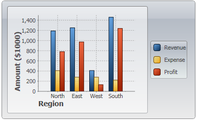
ChartType.Column
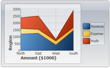
ChartType.AreaStacked
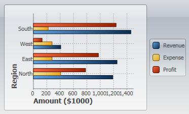
ChartType.Bar
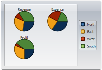
ChartType.Pie