Time-series charts display time along the X-axis. This is a very common type of chart, used to show how values change as time passes.
Most time-series charts show constant time intervals (yearly, monthly, weekly, daily). In this case, the time-series chart is essentially identical to a simple value type chart like the one described above. The only difference is that instead of showing categories along the X axis, the chart will show dates or times. (If the time intervals are not constant, then the chart becomes an XY chart, described in the next section.)
We will now walk through the creation of some time-series charts.
Step 1) Choose the chart type:
The code clears any existing series, then sets the chart type:
| C# |
Copy Code
|
|---|---|
public Window1() { InitializeComponent(); // Clear current chart c1Chart.Reset(true); // Set chart type c1Chart.ChartType = ChartType.Column; } |
|
Step 2) Set up the axes:
We will start by obtaining references to both axes, as in the previous sample. Recall that the Bar chart type uses reversed axes (values are displayed on the Y axis):
| C# |
Copy Code
|
|---|---|
//Get axes Axis valueAxis = c1Chart.View.AxisY; Axis labelAxis = c1Chart.View.AxisX; if (c1Chart.ChartType == ChartType.Bar) { valueAxis = _c1Chart.View.AxisX; labelAxis = _c1Chart.View.AxisY; } |
|
Next we will assign titles to the axes. The axis titles are UIElement objects rather than simple text. We will set up the axis titles using the CreateTextBlock method, the same way we did before. We will also set up the annotation format, minimum value, and major unit. The only difference is we will use a larger interval for the tick marks between values:
| C# |
Copy Code
|
|---|---|
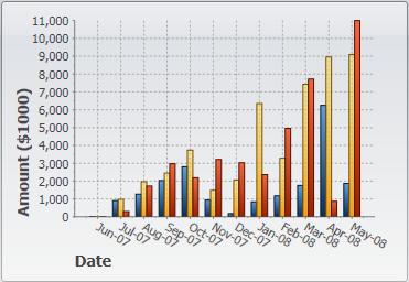
// configure label axis labelAxis.Title = CreateTextBlock("Date", 14, FontWeights.Bold); labelAxis.AnnoFormat = "MMM-yy"; // configure value axis valueAxis.Title = CreateTextBlock("Amount ($1000)", 14, FontWeights.Bold); valueAxis.AnnoFormat = "#,##0 "; valueAxis.MajorUnit = 1000; valueAxis.AutoMin = false; valueAxis.Min = 0; |
|
Step 3) Add one or more data series
This time, we will use the second data-provider method defined earlier:
| C# |
Copy Code
|
|---|---|
// get the data var data = GetSalesPerMonthData(); |
|
Next, we want to display the dates along the label axis. To do this, we will use a Linq statement that retrieves the distinct Date values in our data records. The result is then converted to an array and assigned to the ItemsSource property of the label axis.
| C# |
Copy Code
|
|---|---|
c1Chart.ChartData.ItemNames = (from r in data select r.Date.ToString("MMM-yy")).Distinct().ToArray(); |
|
Note that we used the Distinct Linq operator to remove duplicate date values. That is necessary because our data contains one record per product for each date.
Now we are ready to create the actual DataSeries objects that will be added to the chart. Each series will show the revenue for a given product. This can be done with a Linq statement that is slightly more elaborate than what we used before, but provides a good practical example of the power provided by Linq:
| C# |
Copy Code
|
|---|---|
// add one series (revenue) per product var products = (from p in data select p.Product).Distinct(); foreach (string product in products) { var ds = new DataSeries(); ds.Label = product; ds.ValuesSource = ( from r in data where r.Product == product select r.Revenue).ToArray(); c1Chart.ChartData.Children.Add(ds); } |
|
The code starts by building a list of products in the data source. Next, it creates one DataSeries for each product. The label of the data series is simply the product name. The actual data is obtained by filtering the records that belong to the current product and retrieving their Revenue property. The result is assigned to the ValuesSource property of the data series as before.
Step 4) Adjust the chart’s appearance
Once again, we will finish by setting the Theme and Palette properties to quickly configure the chart appearance:
| C# |
Copy Code
|
|---|---|
c1Chart.Theme = c1Chart.TryFindResource(
            new ComponentResourceKey(typeof(C1.WPF.C1Chart.C1Chart),
            "Office2007Black")) as ResourceDictionary;}
|
|
This concludes the code that generates our time-series charts. The result should be similar to the images below: