By default, the C1Expander control's C1Expander.IsExpandable property is set to True, meaning that the content can be expanded by clicking on the header bar. In some instances, such as when you'd like to prevent expansion until a specific event, you may not want to allow for expansion of the control; in this case, you would set the IsExpandable property to False.
Once the IsExpandable property is set to False, users can no longer interact with the control. If the user hovers over the control when the IsExpandable property is set to False, no mouse-over effect will appear; if the user clicks on the header when the IsExpandable property is set to False, the control will remain collapsed.
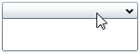
The table below illustrates the behavioral effect of each IsExpandable property setting.
|
IsExpandable |
Result |
|
True |
|
|
False |
|