In Microsoft Expression Blend, you can add custom states and state groups to define a different appearance for each state of your user control – for example, the visual state of the control could change on mouse over. You can view and edit visual states by creating a new template and adding a new template part|tag=PropertyGrid Template Parts. Once you've done so the available visual states for that part will be visible in the Visual States window:
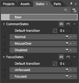
Common states include Normal for the normal appearance of the item, MouseOver for the item on mouse over, and Disabled for when the item is not enabled. Focus states include Unfocused for when the item is not in focus and Focused when the item is in focus.