Step 3 of 3: Running the C1PropertyGrid Application
In This Topic
Now that you've created a WPF application and customized the application's appearance, the only thing left to do is run your application. To run your application and observe PropertyGrid for WPF's run-time behavior complete the following steps:
-
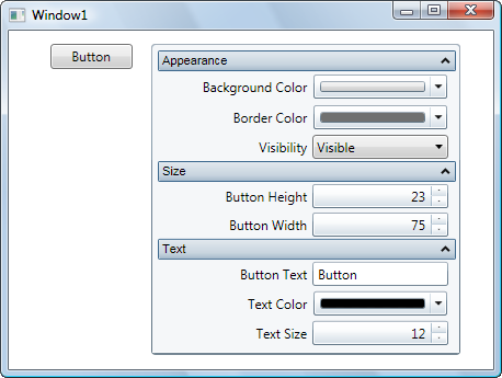
From the Debug menu, select Start Debugging to view how your application will appear at run time.
The application will appear similar to the following:
-
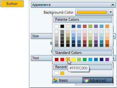
Click the Background Color drop-down arrow and pick a color, for example, orange, from the color picker that appears. The button's background color will change to your selection:
-
Click the Border Color drop-down arrow and pick a color, for example green, from the color picker that appears.
-
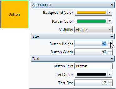
Change the size of the button by entering values in the Button Height and Button Width numeric boxes. For example enter 90 for both values. The application will appear similar to the following:
-
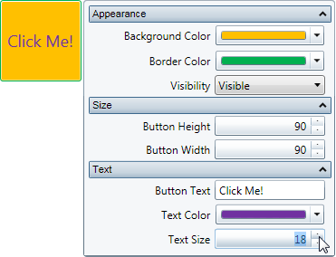
Enter a string, for example "Click Me!" in the Button Text box.
-
Click the Text Color drop-down arrow and pick a color, for example purple, from the color picker that appears.
-
Click the Up or Down arrow next to the Text Size value to change the size of the text that appears on the button control. For example, set the value to 18. The application will appear similar to the following:
Congratulations! You've completed the PropertyGrid for WPF quick start. In this quick start you added the C1PropertyGrid and Button controls to a page, linked the C1PropertyGrid control to the Button, customized the controls, and view the run-time interactions possible with PropertyGrid for WPF.