Extended Library for WPF and Silverlight | ComponentOne
PropertyGrid / PropertyGrid for Silverlight Quick Start / Step 2 of 3: Customizing the C1PropertyGrid Application
In This Topic
    Step 2 of 3: Customizing the C1PropertyGrid Application
    In This Topic

    In the last step you created a Silverlight application and added a Button and the C1PropertyGrid control to the application. In this step you'll customize the C1PropertyGrid control to display specific properties of the Button control.

    To customize and connect the C1PropertyGrid control to the Button control, complete the following steps:

    1. Select c1propertygrid1 in the Objects and Timeline pane and navigate to the Properties window.
    2. In the Properties window, locate the C1PropertyGrid.SelectedObject property, click the small square next to it to access advanced property options, and select the Data Binding option. The Create Data Binding dialog box will appear.
    3. In the Create Data Binding dialog box, click the Element Property tab.
    4. In the left side Scene elements window select button1 and click OK:


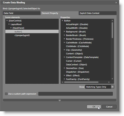
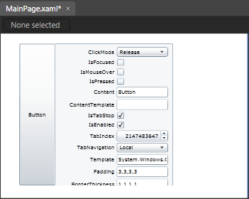
      Notice that all the button's properties are now displayed in the C1PropertyGrid control:


      In the next steps you'll customize the C1PropertyGrid control so that only certain properties are displayed.
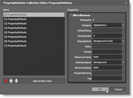
    5. In the Properties window uncheck the C1PropertyGrid.AutoGenerateProperties check box. Now every property will no longer be displayed – only those that you specify.
    6. Locate the C1PropertyGrid.PropertyAttributes collection in the Properties window, and click the ellipsis button next to the item. The Property Attribute Collection Editor dialog box will appear.
    7. In the Property Attribute Collection Editor dialog box, click the Add another item button. Repeat this step seven more times to create a total of eight PropertyAttribute items, numbered 0 to 7.
    8. Set the following Properties in the right-side Properties pane for the items you just added:        


      PropertyAttribute

      Category

      DisplayName

      MemberName

      [0] PropertyAttribute

      Appearance

      Background Color

      Background

      [1] PropertyAttribute

      Appearance

      Border Color

      BorderBrush

      [2] PropertyAttribute

      Appearance

      Visibility

      Visibility

      [3] PropertyAttribute

      Size

      Button Height

      Height

      [4] PropertyAttribute

      Size

      Button Width

      Width

      [5] PropertyAttribute

      Text

      Button Text

      Content

      [6] PropertyAttribute

      Text

      Text Color

      Foreground

      [7] PropertyAttribute

      Text

      Text Size

      FontSize


      The Category identifies what section the item appears in. The DisplayName indicates the name displayed for the item. The MemberName indicates the actual name of the member.


    9. Click the OK button to close the Property Attribute Collection Editor dialog box and change the settings. The page should now look similar to the following image at design time:


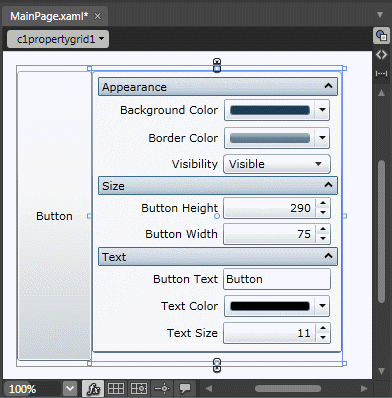
    In this step you'll customized the C1PropertyGrid control to display specific properties of the Button control. In the next step, you'll run the application and view some of the possible run-time interactions.