Extended Library for WPF and Silverlight | ComponentOne
ColorPicker / Quick Start: ColorPicker for Silverlight / Step 2 of 4: Adding C1ColorPicker Controls
In This Topic
    Step 2 of 4: Adding C1ColorPicker Controls
    In This Topic

    In the previous step you created a new Silverlight project and added a Rectangle control with a gradient to the application. In this step you'll continue by adding C1ColorPicker controls that will control the gradient fill in the Rectangle.

    Complete the following steps:

    1. In XAML view, add the following markup just under the </Rectangle> tag to add a StackPanel to the page:
      <StackPanel Height="Auto" Width="Auto" HorizontalAlignment="Center" VerticalAlignment="Center" Orientation="Horizontal"></StackPanel>
      
    2. In the ToolBox click on the Assets button (the double chevron icon) to open the Assets dialog box.
    3. In the Asset Library dialog box, choose the Controls item in the left pane, and then click on the C1ColorPicker icon in the right pane:


      The C1ColorPicker icon will appear in the Toolbox under the Assets button.

    4. Click within the <StackPanel></StackPanel> tags and double-click the C1ColorPicker icon to add the control to the panel.
    5. Click once on the C1ColorPicker control in design view, navigate to the Properties window and set the following properties:
      • Set Name to "c1cp1" to give the control a name so it is accessible in code.
      • Set Width to "65" and Height to "50".
      • Set HorizontalAlignment and VerticalAlignment to Center to center the control in the panel.
      • Set the Left, Right, Top, and Bottom Margin properties to "5".
      • Set DropDownDirection to AboveOrBelow to control how the control opens.
      • Set the Mode to Advanced so only the advanced color picker appears.
      • Set the SelectedColor to Black (or "#FF000000").

      The XAML will appear similar to the following:

      <c1:C1ColorPicker x:Name="c1cp1" Width="65" Height="50" HorizontalAlignment="Center" VerticalAlignment="Center" Margin="5" DropDownDirection="AboveOrBelow" Mode="Advanced" SelectedColor="Black"/>
      
    6. Add a second C1ColorPicker control to the StackPanel, by adding the following XAML just after the <c1:C1ColorPicker x:Name="c1cp1"/> tag:
      <c1:C1ColorPicker x:Name="c1cp2" Width="65" Height="50" HorizontalAlignment="Center" VerticalAlignment="Center" Margin="5" DropDownDirection="BelowOrAbove" Mode="Both" SelectedColor="White"/>
      

      Note that some properties have been set to different values, including the Mode and DropDownDirection which have been set to their default values.

    7. In XAML view, replace the Width="640" Height="480" in the <UserControl> tag with Width="Auto" Height="Auto" so it appears similar to the following:
      <UserControl xmlns="http://schemas.microsoft.com/winfx/2006/xaml/presentation" xmlns:x="http://schemas.microsoft.com/winfx/2006/xaml" xmlns:c1="clr-namespace:C1.Silverlight.Extended;assembly=C1.Silverlight.Extended" x:Class="C1ColorPicker.MainPage" Width="Auto" Height="Auto">
      

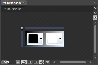
      The page's Design view should now look similar to the following image:


    You've successfully set up your application's user interface, but if you run your application right now the color pickers will do nothing if you select a color. In the next step you'll add code to your application to add functionality to the controls.