In the last step, you customized the appearance and behavior of the C1Expander control. In this step, you will add controls to the C1Expander control's content area and then run the project to observe the run-time features of the application you created in this quick start.
Complete the following steps:
| XAML |
Copy Code
|
|---|---|
<c1:C1Expander Height="200" Width="250" Background="Aqua" Header="Expander Quick Start" ExpandDirection="Up"> <StackPanel></StackPanel> </c1:C1Expander> |
|
You are adding a StackPanel control to the C1Expander control's content area because you'll be adding more than one control to the content area in this quick start. The C1Expander control, as a content control, can only accept one child item at a time; however, you can get around this limitation by adding a panel-based control, which can accept multiple child items, to the C1Expander control.
HorizontalAlignment="Center" to the <StackPanel> tag so that all content added to the panel will be centered. The XAML markup will resemble the following:
<StackPanel HorizontalAlignment="Center">
| XAML |
Copy Code
|
|---|---|
<StackPanel HorizontalAlignment="Center" > <TextBlock></TextBlock> <TextBlock></TextBlock> <TextBlock></TextBlock> </StackPanel> |
|
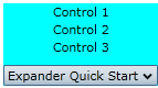
Text="Control 1" to the first <TextBlock> tag, Text="Control 2" to the second <TextBlock> tag, and Text="Control 3" to the third <TextBlock> tag so that the XAML markup resembles the following:
| XAML |
Copy Code
|
|---|---|
<TextBlock Text="Control 1"></TextBlock> <TextBlock Text="Control 2"></TextBlock> <TextBlock Text="Control 3"></TextBlock> |
|
Congratulations! You have successfully completed the Expander for Silverlight quick start. In this quick start, you've created and customized an Expander for Silverlight application, added content to the control content area, and observed several of the control's run-time features.