We are now ready to create an ICellFactory object that creates custom cells to display the following elements:
We accomplish all of these tasks using a custom MusicCellFactory class that implements the ICellFactory interface. To use the custom cell factory, we assign it to the grid's CellFactory property:
| C# |
Copy Code
|
|---|---|
_flexiTunes.CellFactory = new MusicCellFactory()
|
|
The MusicCellFactory class inherits from the default CellFactory class and overrides the CreateCellContent method to create the elements used to represent the content in each cell.
The CreateCellContent method takes as parameters the parent grid, a Border element that is created by the base class and provides the cell's background and borders, and a CellRange object that specifies the cell to create (this may be a single cell or multiple cells if they are merged).
Note that CreateCellContent only creates the cell content. If we want to take over the creation of the entire cell (including border and background), we override the CreateCell method instead.
In our example, the CreateCellContent method handles two main cases: regular cells and cells in group rows.
To handle regular cells, the method returns new SongCell or RatingCell elements depending on the column being created. These are custom elements that derive from StackPanel and contain images and text which are bound to the data item represented by the cell.
Cells in group rows are a little more complicated. In our application, group rows represent artists and albums. These items do not correspond to data items in the source collection. Our CreateCellContent method deals with this by creating fake Song objects to represent artists and albums. These fake Song objects have properties calculated based on the songs contained in the group. The Duration of an album is calculated as the sum of the Duration of each song in the album, and the Rating is calculated as the average Rating of the songs in the album. Once this fake Song object is created, we can use the SongCell and RatingCell elements as usual.
Here is a slightly simplified version of the MusicCellFactory class and its CreateCellContent implementation:
| C# |
Copy Code
|
|---|---|
// cell factory used to create iTunes cells public class MusicCellFactory : CellFactory { // override this to create the cell contents (the base class already // created a Border element with the right background color) public override void CreateCellContent( C1FlexGrid grid, Border bdr, CellRange range) { // get row var row = grid.Rows[range.Row]; var gr = row as GroupRow; // special handling for cells in group rows if (gr != null && range.Column == 0) { BindGroupRowCell(grid, bdr, range); return; } // create a SongCell to show artist, album, and song names var colName = grid.Columns[range.Column].ID; if (colName == "Name") { bdr.Child = new SongCell(row); return; } // create a RatingCell to show artist, album, and song ratings if (colName == "Rating") { var song = row.DataItem as Song; if (song != null) { bdr.Child = new RatingCell(song.Rating); return; } } // use default binding for everything else base.CreateCellContent(grid, bdr, range); } |
|
The BindGroupRowCell method creates the fake Song objects mentioned earlier, assigns them to the row's DataItem property so they can be used by the CreateCellContent method, and provides special handling for the first cell in the group row. The first cell in each group row is special because it contains the group's collapse and expand button in addition to the regular cell content.
Here is the code that handles the first item in each group row:
| C# |
Copy Code
|
|---|---|
// bind cells in group rows void BindGroupRowCell(C1FlexGrid grid, Border bdr, CellRange range) { // get row, group row var row = grid.Rows[range.Row]; var gr = row as GroupRow; // first cell in the row contains custom collapse/expand button // and an artist, album, or song image if (range.Column == 0) { // build fake Song object to represent group if (gr.DataItem == null) { gr.DataItem = BuildFakeSong(gr); } // create the first cell in the group row bdr.Child = gr.Level == 0 ? (ImageCell)new ArtistCell(row) : (ImageCell)new AlbumCell(row); } } |
|
Finally, here is the code that creates the fake Song objects that represent artists and albums. The method uses the GroupRow.GetDataItems method to retrieve a list of all data items contained in the group. It then uses a LINQ statement to calculate the total size, duration, and average rating of the songs in the group.
| C# |
Copy Code
|
|---|---|
// build fake Song objects to represent groups (artist or album) Song BuildFakeSong(GroupRow gr) { var gs = gr.GetDataItems().OfType<Song>(); return new Song() { Name = gr.Group.Name.ToString(), Size = (long)gs.Sum(s => s.Size), Duration = (long)gs.Sum(s => s.Duration), Rating = (int)(gs.Average(s => s.Rating) + 0.5) }; } |
|
That is most of the work required. The only part left is the definition of the custom elements used to represent individual cells. The elements are:
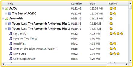
The image below shows how the elements appear in the grid:
These are all regular WPF Framework elements. They can be created with Microsoft Blend or in code.
The code below shows the implementation of the RatingCell element. The other elements are similar; you can review the implementation details by looking at the sample source code.
| C# |
Copy Code
|
|---|---|
/// /// Cell that shows a rating value as an image with stars. /// public class RatingCell : StackPanel { static ImageSource _star; public RatingCell(int rating) { if (_star == null) { _star = ImageCell.GetImageSource("star.png"); } Orientation = Orientation.Horizontal; for (int i = 0; i < rating; i++) { Children.Add(GetStarImage()); } } Image GetStarImage() { var img = new Image(); img.Source = _star; img.Width = img.Height = 17; img.Stretch = Stretch.None; return img; } } |
|
The RatingCell element is very simple. It consists of a StackPanel with some Image elements in it. The number of Image elements is defined by the rating being represented, a value passed to the constructor. Each Image element displays a star icon. This is a static arrangement that assumes that the ratings do not change, so we do not need any dynamic bindings.