Column Header Menu
In This Topic
FlexGrid provides column header menu that allows end users to perform column-based actions at runtime like sorting, grouping, filtering, and auto-sizing the column. This helps user to apply sorting and filtering on each column data type separately. By default, FlexGrid applies the filter automatically whenever you input the character in the filter text box, but you can also change this behavior by adding Apply and Clear button same as Excel. You can use the GridColumnOptionsMenuVisibility property to set the visibility of the column-header menu.
The following table shows the column header menu based on different column data type.
| Columns | Column Header Menu |
|---|---|
| Text Column | 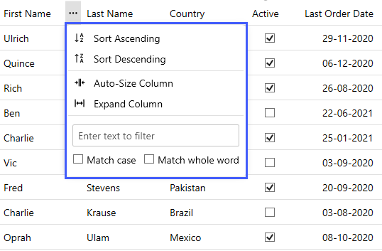 |
| CheckBox Column | 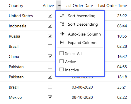 |
| Numeric Column | 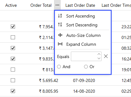 |
| DateTime Column | 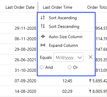 |