Validation lets you control and define the type of data that is acceptable in a particular column cell, such as text, numbers, and dates. It allows you to limit the range of acceptable values or restrict the entries to a specific format. There are various ways in which data can be validated such as, restricting invalid input keys, showing the error or warning information or revert the value to original on getting an invalid input from the user. FlexGrid supports data validation when bound to a datatable and allows you to style the validation rules to provide visual cues and enhance the user experience by making the validation rules noticeable and user-friendly. It provides the following properties to control how the errors are displayed:
The following image showcases validation errors in FlexGrid.
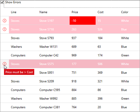
Let us have a look at an example that showcases how validation errors are displayed in FlexGrid and how they appear on setting different error styles. Validation in FlexGrid honors standard IDataErrorInfo and INotifyDataErrorInfo interfaces implemented in the data-items. In this example, we have used ProductBase class, which contains data and ProductNotifyDataErrorInfo class, which implements INotifyDataErrorInfo and contains all the validation error conditions.
| C# |
Copy Code
|
|---|---|
public MainWindow() { InitializeComponent(); var list = new List<ProductNotifyDataErrorInfo>(); for (int i = 0; i < 20; i++) { list.Add(new ProductNotifyDataErrorInfo()); } list[0].Price = -10; // to check error on property level grid.ItemsSource = list; } private void ShowErrorCheckedChanged(object sender, RoutedEventArgs e) { grid.ShowErrors = (sender as CheckBox).IsChecked.Value; } |
|
| XAML |
Copy Code
|
|---|---|
<CheckBox Content="Show Erors" Checked="ShowErrorCheckedChanged" Unchecked="ShowErrorCheckedChanged" /> <c1:FlexGrid x:Name="grid" Grid.Row="1" HeadersVisibility="All" ShowErrors="False"> <c1:FlexGrid.Columns> <c1:GridColumn Binding="Line"/> <c1:GridColumn Binding="Name"/> <c1:GridColumn Binding="Price"/> <c1:GridColumn Binding="Cost"/> <c1:GridColumn Binding="Color"/> </c1:FlexGrid.Columns> <c1:FlexGrid.RowErrorStyle> <Style TargetType="ContentControl"> <Setter Property="Foreground" Value="White"/> <Setter Property="Background" Value="#FFC0CB"/> </Style> </c1:FlexGrid.RowErrorStyle> <c1:FlexGrid.ErrorStyle> <Style TargetType="ContentControl"> <Setter Property="Foreground" Value="White"/> <Setter Property="Background" Value="Red"/> </Style> </c1:FlexGrid.ErrorStyle> <c1:FlexGrid.RowHeaderErrorStyle> <Style TargetType="ContentControl"> <Setter Property="Foreground" Value="Red"/> </Style> </c1:FlexGrid.RowHeaderErrorStyle> </c1:FlexGrid> |
|