FlexPivotPanel forms the core control available with FlexPivot. The FlexPivotPanel control is designed to provide an Excel-like drag-and-drop UI that enables users to define custom views of the data. The control displays a list containing all the fields that exist in the data. Users can drag and drop these fields to lists that represent the row and column dimensions of the output table, the values summarized in the output data cells, and the fields used for filtering the data.
At the core of this control is a powerful data engine that is responsible for fetching raw data from the data source as per the criteria selected by the user. Here, the criteria for data selection is determined by the fields enlisted in the various lists appearing on the panel.
The FlexPivotPanel control bound to a data source appears similar to the image below.
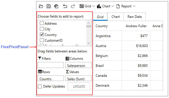
The following table describes the lists that are included in the FlexPivotPanel control and their purpose.
| C1FlexPivotPanel Area | Description |
| Filters | Specifies the field to filter. |
| Rows | The items added to the Rows list become the row headers of a grid. These items populate the Y-axis in a chart. |
| Columns | The items added to the Column list become the column headers of a grid. These items populate the legend in a chart. |
| Values | Shows the summation of the specified field. |
| Defer Updates | Suspends automatic updates that occur when the user modifies the view definition when this checkbox is selected. |
Right-clicking the Filter, Rows, Columns, or Values lists at runtime opens a context menu as shown in the image below.
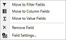
This context menu allows you to do the following.