The FlexChartField in FlexReport allows you to set a specific chart type using C1.Chart.ChartType property. It allows you to visualize data through different chart types such as Area, Bar, Bubble, Candlestick, Column, Funnel, HighLowOpenClose, Histogram, Line, LineSymbols, RangedHistogram, Scatter, Spline, SplineArea, SplineSymbols, Step, StepArea and StepSymbols. The chart types can be easily selected using the ChartType property in the Properties window of the FlexReportDesigner.
Area charts are line charts with area between the line chart and axis filled with a color or shading. Each series is drawn on top of the preceding series.
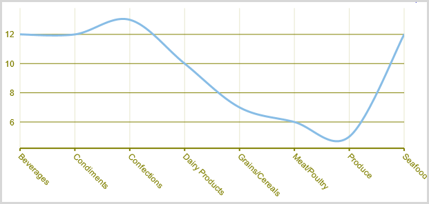
A SplineArea Chart is similar to an area chart. The only difference is that it connects data points using splines instead of straight lines and fills the area enclosed by the splines.

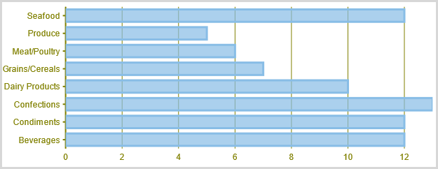
Bar charts compare categorical data through the horizontal bars, where length of each bar represents the value of the corresponding category. Y-axis in these charts is a category axis.
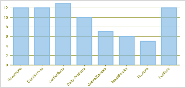
Column charts are simply vertical version of bar charts and they use X- axis as a category axis. Though bar charts and column charts can be used interchangeably, column charts are preferred where number of values is too large to be accommodated on an X-axis while bar charts are preferred in the case of long category titles which are difficult to fit on an X-axis or in the case of large number of categories.
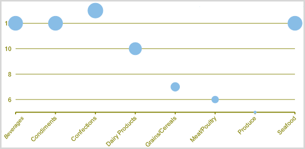
A Bubble chart combines two independent values to supply both the point y value and the point sizes. Bubble charts are used to represent an additional data value at each point by changing its size. The Y array elements determine the Cartesian position (as in a XY-Plot chart), and the Y1 element values determine the size of the bubble at each point. The size of the points can be encoded according to area or diameter.
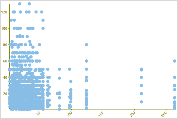
A Scatter chart uses two values to represent each data point. It depicts relationship among items of different data series. This type of chart is often used to represent scientific data, and can highlight the deviation of assembled data from predicted data or result.
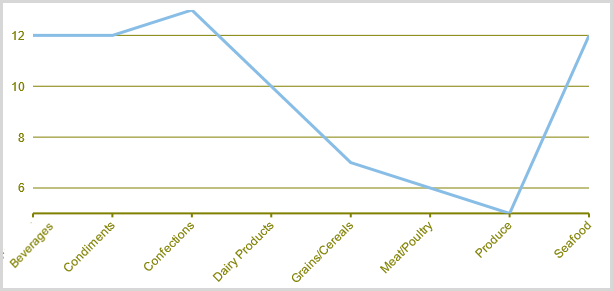
A Line chart displays trends over a period of time by connecting different data points in a series with a straight line. It is the most effective way of denoting changes in the values between different groups of data.
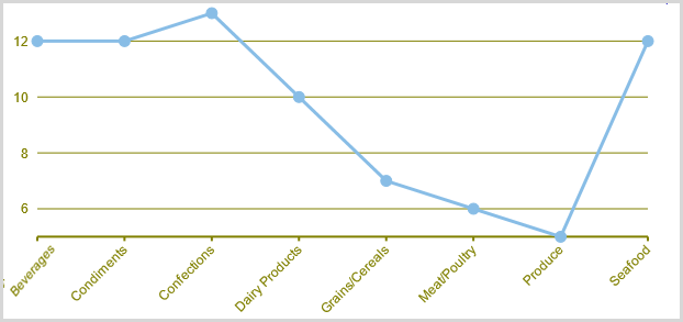
A LineSymbols chart is a combination of the Line chart and the Scatter chart. The chart plots data points by using symbols and connects those data points by using lines.
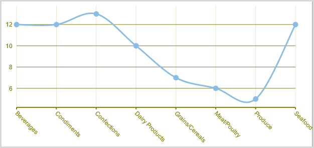
A Spline chart is similar to a line chart except that it connects data points by using splines rather than straight lines. It is specifically used for representing data that requires the use of curve fittings.
A SplineSymbols chart combines the Spline chart and the Scatter chart. The chart plots data points by using symbols and connects those data points by using splines.
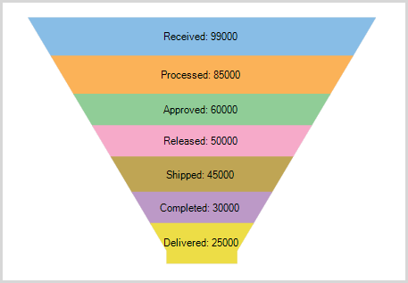
A funnel chart represents sequential stages in a linear process. This chart can be useful in identifying potential problem areas in processes where it is noticeable at what stages and rate the values decrease.
Stock charts used in financial applications to show the opening, closing, high and low prices of a given stock. The types of stock charts are as follows:
Candlestick Chart: A Candlestick chart is a special type of HighLowOpenClose chart that integrates Bar and Line charts to depict a range of values over time. It consists of visual elements known as candles that are further comprised of three elements: body, wick, and tail. The body represents the opening and the closing value, while the wick and the tail represent the highest and the lowest value respectively.
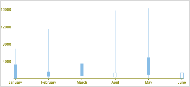
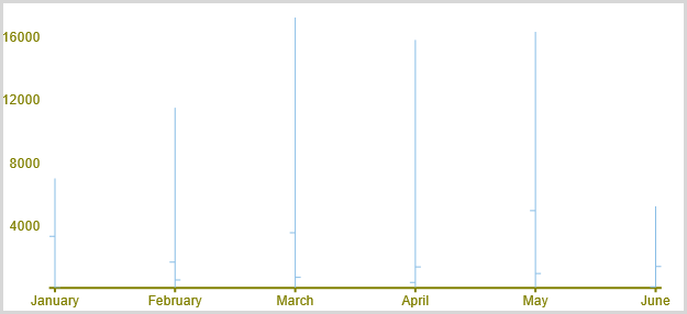
HighLowOpenClose: HighLowOpenClose charts combine four independent values to supply high, low, open, and close data for a point in a series. In addition to showing the high and low value of a stock, the Y2 and Y3 array elements represent the stock's opening and closing price, respectively.
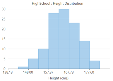
Histograms are visual representation of data distribution over a continuous interval or certain time period. These charts comprise of vertical bars to indicate the frequency in each interval or bin created by dividing the raw data values into a series of consecutive and non-overlapping intervals.
Ranged histogram is a modern Excel-like histogram chart that helps visualize frequency distribution on Y-axis, against ranged X-axis. Like histogram chart type, bins are created by dividing the raw data values into a series of consecutive, non-overlapping intervals.

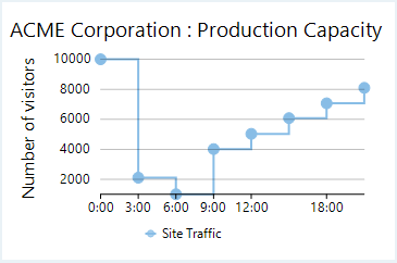
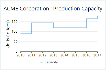
Step charts use vertical and horizontal lines to connect the data points to form a step-like progression. These charts are generally used to demonstrate the sudden change in data that might occur on irregular intervals and remains constant till the next change.
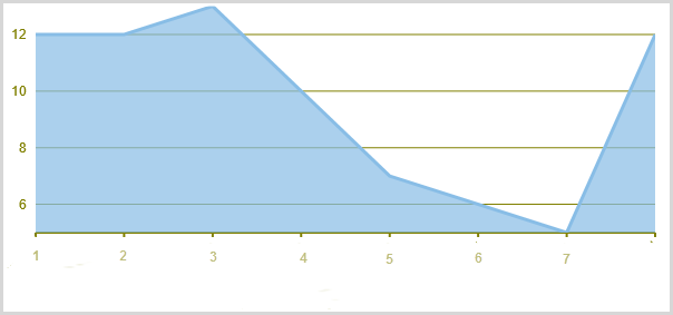
Step area charts are area charts in which points are connected by vertical and horizontal line segments, that resemble staircase steps. The area between X-axis and line segment is filled with color or some pattern.

Step symbol chart is a slight variation of step chart and is displayed with markers on the data points. These charts are used when it is required to know the exact data points which have been used to plot the chart.