By default, the C1Knob control displays a simple blue-gray background and a pointer. Like with C1RadialGauge and C1LinearGauge, you can customize the indicators of the grid by adding the C1GaugeMark, C1GaugeLabel, and C1GaugeRange elements to the gauge's C1Gauge.Decorators collection:
The decorators are displayed at specific positions on the scale, determined by the value of the C1GaugeDecorator.From, C1GaugeDecorator.To, and C1GaugeMark.Interval properties.
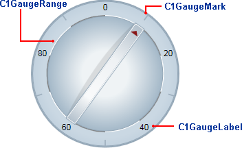
In the image above, you'll see one C1GaugeMark and one C1GaugeLabel element:
| XAML |
Copy Code
|
|---|---|
<!-- Add tick marks --> <c1:C1GaugeMark Interval="20" Alignment="In" From="10" /> <!-- Add label marks --> <c1:C1GaugeLabel Interval="20" Alignment="Center" Location="0.9" To="80" /> |
|
The C1GaugeLabel element shows labels for the values 10 to 90 along the scale. The C1GaugeMark element shows tick marks spaced 20 units apart.
In addition to showing the scale, you may want to highlight parts of the scale range by adding one or more C1GaugeRange elements to the gauge's C1Gauge.Decorators collection.
In the image above, you'll see ten C1GaugeRange elements:
| XAML |
Copy Code
|
|---|---|
<!-- Add ten colored ranges --> <c1:C1GaugeRange From="0" To="10" Location="0.7" Fill="White" /> <c1:C1GaugeRange From="10" To="20" Location="0.7" Fill="Gray" /> <c1:C1GaugeRange From="20" To="30" Location="0.7" Fill="White" /> <c1:C1GaugeRange From="30" To="40" Location="0.7" Fill="Gray" /> <c1:C1GaugeRange From="40" To="50" Location="0.7" Fill="White" /> <c1:C1GaugeRange From="50" To="60" Location="0.7" Fill="Gray" /> <c1:C1GaugeRange From="60" To="70" Location="0.7" Fill="White" /> <c1:C1GaugeRange From="70" To="80" Location="0.7" Fill="Gray" /> <c1:C1GaugeRange From="80" To="90" Location="0.7" Fill="White" /> <c1:C1GaugeRange From="90" To="100" Location="0.7" Fill="Gray" /> |
|
The C1GaugeRange elements show white and gray range areas. Each C1GaugeRange element displays a curved swath along the scale. The color of the swath is determined by the C1GaugeRange.Fill property, and the position is determined by the C1GaugeDecorator.From and C1GaugeDecorator.To properties You can control the thickness of the ranges using the C1GaugeRange.StrokeThickness property.