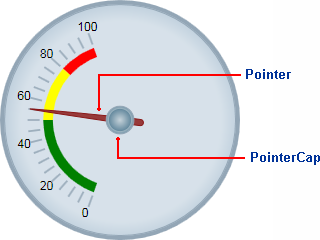
The C1RadialGauge control includes a pointer which indicates the selected C1Gauge.Value of the control. The pointer consists of the actual C1Gauge.Pointer element and the C1RadialGauge.PointerCap element:
The C1RadialGauge.PointerOrigin property sets the location of the pointer; you can customize the location of the pointer by setting this property – for example the point (0, 0) is the top-left corner of the control and the point (0.5, 0.5) is the center of the control. The C1RadialGaugePointer.Location property sets the relative location of the C1Gauge.Pointer element.
The C1Gauge.Pointer element appears by default as a brown tapering element, but you can customize the appearance of the Pointer element by setting several properties, including the C1Gauge.PointerFill, C1Gauge.PointerLength, C1Gauge.PointerOffset, C1Gauge.PointerStroke, C1Gauge.PointerStrokeThickness, C1Gauge.PointerStyle, C1Gauge.PointerVisibility, and C1Gauge.PointerWidth properties.
The C1RadialGauge.PointerCap element appears by default as a gray circle, but you can customize the appearance of the PointerCap element by setting several properties, including the PointerCap, C1RadialGauge.PointerCapFill, C1RadialGauge.PointerCapStroke, C1RadialGauge.PointerCapStrokeThickness, and C1RadialGauge.PointerCapStyle properties. You can also edit the C1RadialGauge.PointerCapSize template. For more information, see the Templates topic.