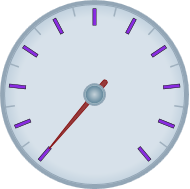
By default, gauge marks are drawn as blue-gray rectangles. You can customize their appearance by assigning a custom template to the C1GaugeMark.Template property of the C1GaugeMark element. In the following steps, you'll create a new DataTemplate which defines the C1GaugeMark appearance and then you'll assign that template to the C1GaugeMark element's Template property in the C1RadialGauge control.
Complete the following steps:
| XAML |
Copy Code
|
|---|---|
<c1:C1LinearGauge Height="89" Margin="90,72,41,88" Name="C1LinearGauge1" Width="287"> <c1:C1GaugeMark From="0" To="100" Interval="10" Template="{StaticResource MyMarkTemplate}"/> <c1:C1GaugeMark Interval="5" Location="1.1" /> </c1:C1LinearGauge> |
|
| XAML |
Copy Code
|
|---|---|
<Window.Resources> <!-- Template used to render the gauge marks --> <DataTemplate x:Key="MyMarkTemplate"> <Rectangle Width="4" Height="18" Fill="BlueViolet" Stroke="Black" StrokeThickness=".5"/> </DataTemplate> </Window.Resources> <UserControl.Resources> <!-- Template used to render the gauge marks --> <DataTemplate x:Key="MyMarkTemplate"> <Rectangle Width="4" Height="18" Fill="BlueViolet" Stroke="Black" StrokeThickness=".5"/> </DataTemplate> </UserControl.Resources> |
|
This template defines the appearance of the tick marks.
<c1:C1GaugeMark From="0" To="100" Interval="10" Template="{StaticResource MyMarkTemplate}"/>
Run your project and observe:
The C1RadialGauge control appears with custom tick marks:

Notice that the marks are drawn from the position specified by the C1GaugeDecorator.Location property and grow inward. If you increase the Height of the rectangles used to show the marks, the tick marks will extend farther toward the center of the gauge. To make them extend out you would change the Location property on the C1GaugeMark element. Also, notice how elements used to show tick marks are rotated along the scale; elements used to show labels are not (see Adding Labels to the Gauge).