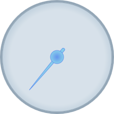
By default, the C1Gauge.Pointer appears as a tapered brown rectangle and the pointer cap appears as a gray circle with a gradient. You can customize the appearance of both. In the following steps, you'll customize the appearance of the C1RadialGauge control's Pointer and C1RadialGauge.PointerCap.
Complete the following steps:
| XAML |
Copy Code
|
|---|---|
<c1:C1RadialGauge Height="226" Margin="22,24,0,12" Name="C1RadialGauge1" Width="256" PointerFill="SkyBlue" PointerStroke="CornflowerBlue"> </c1:C1RadialGauge> |
|
This will set customize the color of the Pointer.
| XAML |
Copy Code
|
|---|---|
<c1:C1RadialGauge Height="226" Margin="22,24,0,12" Name="C1RadialGauge1" Width="256" PointerFill="SkyBlue" PointerCapStroke="CornflowerBlue" PointerStroke="CornflowerBlue"> </c1:C1RadialGauge> |
|
This will customize the color that the PointerCap is outlined in.
| XAML |
Copy Code
|
|---|---|
<c1:C1RadialGauge Height="226" Margin="22,24,0,12" Name="C1RadialGauge1" Width="256" PointerFill="SkyBlue" PointerCapStroke="CornflowerBlue" PointerStroke="CornflowerBlue" > <c1:C1RadialGauge.PointerCapFill> <RadialGradientBrush> <GradientStop Color="CornflowerBlue" Offset="0"/> <GradientStop Color="SkyBlue" Offset="1"/> </RadialGradientBrush> </c1:C1RadialGauge.PointerCapFill> </c1:C1RadialGauge> |
|
This will add a radial gradient to the C1RadialGauge control's PointerCap.
Run your project and observe:
The C1RadialGauge control appears with a customized Pointer and PointerCap: