In this step you'll set up the application by adding C1RadialGauge, C1LinearGauge, and C1Knob controls to the project as well as a standard TextBox control which will display the current value of the gauge controls.
To set add the gauge controls to your application, complete the following steps:
| XAML |
Copy Code
|
|---|---|
<UserControl xmlns:c1="http://schemas.componentone.com/winfx/2006/xaml" x:Class="C1Gauges.MainPage" xmlns="http://schemas.microsoft.com/winfx/2006/xaml/presentation" xmlns:x="http://schemas.microsoft.com/winfx/2006/xaml" xmlns:d="http://schemas.microsoft.com/expression/blend/2008" xmlns:mc="http://schemas.openxmlformats.org/markup compatibility/2006" mc:Ignorable="d" d:DesignWidth="640" d:DesignHeight="480"> <Grid x:Name="LayoutRoot"> <StackPanel x:Name="sp1" Width="Auto" Height="Auto" Orientation="Vertical" HorizontalAlignment="Center" VerticalAlignment="Center"> <StackPanel x:Name="sp2" Width="Auto" Height="Auto" Orientation="Horizontal" HorizontalAlignment="Center" VerticalAlignment="Center"> <c1:C1Knob></c1:C1Knob> </StackPanel> </StackPanel> </Grid> </UserControl> |
|
Note that the C1.Silverlight.Gauge namespace and <c1:C1Knob></c1:C1Knob> tags have been added to the project.
<c1:C1Knob x:Name="c1kb1">
By giving it a unique identifier, you'll be able to access the control in code.
<c1:C1Knob x:Name="c1kb1" Width="150">
The control will appear smaller when the application is run.
<c1:C1Knob x:Name="c1kb1" Width="150" Margin="5">
This will add spacing between the C1Knob and other controls you will add to the page.
<c1:C1Knob x:Name="c1kb1" Width="150" Margin="5" ValueChanged="c1kb1_ValueChanged">
You will add code for this event handler in a later step.
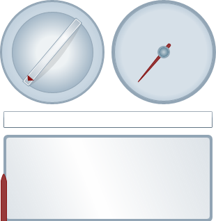
<c1:C1RadialGauge x:Name="c1rg1" Width="150" Margin="5">
</c1:C1RadialGauge>
This will give the C1RadialGauge a name, resize the control, and add spacing between this and other controls.
<TextBox x:Name="tb1" Width="300" Margin="5" TextChanged="tb1_TextChanged">
</TextBox>
This will give the TextBox a name, resize the control, and add spacing between this and other controls. You will add code for the event handler in a later step.
<c1:C1LinearGauge x:Name="c1lg1" Width="300" Height="125" Margin="5">
</c1:C1LinearGauge>
This will give the C1LinearGauge control a name, resize the control, and add spacing between this and other controls.
You've successfully set up your application's user interface – you've added Gauges for Silverlight controls to the application and customized those controls. In the next step you'll add code to your application.