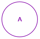
The RadialMenu's Navigation Button is the first thing a user will see when they right tap the application. You can customize the Navigation Button with the RadialMenu's Icon property and NavigationButtonRelativeSize property. The NavigationButtonRelativeSize property allows you to set the Navigation Button's size relative to the size of the RadialMenu. By default, this property is set to 0.15.
For example, this is the default Navigation Button, with the NavigationButtonRelativeSize set to 0.15:

Here's the Navigation Button when you set the NavigationButtonRelativeSize property to 0.45:

You can also change the Icon property. By default, the Icon property is set to "A".
Here's the default Navigation Button with the Icon property changed, and the NavigationButtonRelativeSize property set to 0.25:

To change the size of the Navigation Button, or to change the Icon property, you can reference the following XAML:
| XAML |
Copy Code
|
|---|---|
<c1:C1RadialMenu x:Name="contextMenu" Offset="-130,0" Icon="Tap" NavigationButtonRelativeSize="0.25" ItemClick="contextMenu_ItemClick"></c1:C1RadialMenu> |
|