The C1OlapPanel control is the core of the C1OlapGrid product. It has a DataSource property that takes raw data as input, and an PivotTable property that provides custom views summarizing the data according to criteria provided by the user. The PivotTable is a regular DataTable object that can be used as a data source for any regular control.
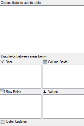
The C1OlapPanel also provides the familiar, Excel-like drag and drop interface that allows users to define custom views of the data. The control displays a list containing all the fields in the data source, and users can drag the fields to lists that represent the row and column dimensions of the output table, the values summarized in the output data cells, and the fields used for filtering the data.
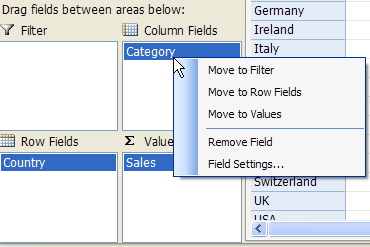
At the core of the C1OlapPanel control, there is a C1OlapEngine object that is responsible for summarizing the raw data according to criteria selected by the user. These criteria are represented by C1OlapField objects, which contain a connection to a specific column in the source data, filter criteria, formatting and summary options. The user creates custom views by dragging C1OlapField objects from the source Fields list to one of four auxiliary lists: the RowFields, ColumnFields, ValueFields, and FilterFields lists. Fields can be customized using a context menu.
Notice that the C1OlapGrid architecture is open. The C1OlapPanel takes any regular collection as a DataSource, including data tables, generic lists, and LINQ enumerations; it then summarizes the data and produces a regular DataTable as output. C1OlapGrid includes two custom controls that are optimized for displaying the OLAP data, the C1OlapGrid and C1OlapChart, but you could use any other control as well.
The C1OlapPanel looks like this:
|
C1OlapPanel Area |
Description |
|
Filter |
Specifies the field to filter. |
|
Row Field |
The items in the field specified become the row headers of a grid. These items populate the Y-axis in a chart. |
|
Column Fields |
The items in the field specified become the column headers of a grid. These items are used to populate the legend in a chart. |
|
Values |
Shows the sum of the field specified. |
|
Defer Updates |
Suspends the automatic updates that occur while the user modifies the view definition when this checkbox is selected. |
If you right-click fields in the Filter, Column Fields, Row Fields, or Values area at run time, a context menu appears, allowing you to move the field to a different area. You can also remove the field or click Field Settings to format and apply a filter to the field. See Filtering Data in a Field for more information.