OutlookBar for WPF and Silverlight supports ComponentOne's ClearStyle technology, which allows you to easily change control colors without having to change control templates. By setting a few color properties, you can quickly style the C1OutlookBar elements. The supported properties for C1OutlookBar are listed in the following table:
|
Property |
Description |
|
Background |
Gets or sets the background used to fill the C1OutlookBar. |
|
Foreground |
Gets or sets the foreground used to fill the C1OutlookBar. |
|
MouseOverBrush |
Gets or sets the brush used to highlight an item when the mouse is hovering over it. |
|
SelectedBackground |
Gets or sets the brush used to fill the selected C1OutlookItem in the C1OutlookBar. |
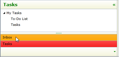
You can completely change the appearance of the C1OutlookBar by setting these properties. For example, if you set the ItemBackground property to Beige, ItemForeground to Green, MouseOverBrush to Orange, and SelectedBackground to Red so the XAML markup appears similar to the following:
<c1:C1OutlookBar Background="Beige" Foreground="Green" MouseOverBrush="Orange" SelectedBackground="Red" x:Name="C1OutlookBar1">
The C1OutlookBar will look similar to this: