Tables are represented by instances of the RenderTable class in PrintDocument. To create a table, just invoke the constructor of the class.
| C# |
Copy Code
|
|---|---|
RenderTable rt1 = new RenderTable(); |
|
To add content to a table, you must populate its cells with data. This can be done in one of the following ways:
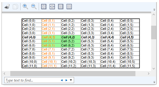
Let's say you want to create a table with 10 rows and 4 columns. The following code snippet depicts adding rows and columns to a table by setting the cell's Text property to a string.
| C# |
Copy Code
|
|---|---|
// Create a table and fill all its cells with some demo data RenderTable rt1 = new RenderTable(doc); const int ROWS = 10; const int COLS = 4; for (int row = 0; row < ROWS; ++row) { for (int col = 0; col < COLS; ++col) { RenderText celltext = new RenderText(doc); celltext.Text = string.Format("Cell ({0},{1})", row, col); // Note that rt1.Cells[row, col] will create cells on demand - // no need to specify the number of rows/cols initially. rt1.Cells[row, col].RenderObject = celltext; } } // add the table to the document doc.Body.Children.Add(rt1); |
|
| C# |
Copy Code
|
|---|---|
RenderTable rt1 = new RenderTable();
for (int row = 0; row < 10; ++row)
{
    for (int col = 0; col < 4; ++col)
        rt1.Cells[row, col].Text = string.Format(
          "Text in cell({0}, {1})", row, col);
}
|
|
At any time, you can find out the actual current size of a table by querying the values of properties Cols.Count (which returns the current number of columns) and Rows.Count (which returns the current number of rows).
All the cells in a table are represented by the Cells collection, which has the type TableCellCollection. The elements in this collection representing individual cells have the type TableCell.
To access any cell in a table, the Cells collection can be indexed by the cell's row and column like this:
| C# |
Copy Code
|
|---|---|
RenderTable rt = new RenderTable(); … // get cell at row 10, column 4: TableCell tc = rt.Cells[10, 4]; |
|
| C# |
Copy Code
|
|---|---|
Table columns can be accessed via the Cols collection, which has the type TableColCollection, and contains elements of the type TableCol, while table rows are accessed via the Rows collection, which has the type TableRowCollection, and contains elements of the type TableRow.
Both rows and columns in the PrintDocument tables can be auto-sized but the default behavior is different for rows and columns. By default, rows have auto-height (calculated based on the content of cells in the row), while columns' widths are fixed. The default width of a RenderTable is equal to the width of its parent, and the width is shared equally between all columns.
The following code will create a page-wide table, with 3 equally wide columns, and 10 rows with the heights that auto-adjust to the height of the cells' content:
| C# |
Copy Code
|
|---|---|
RenderTable rt = new RenderTable(); rt.Style.GridLines.All = LineDef.Default; for (int row = 0; row < 10; ++row) for (int col = 0; col < 3; ++col) rt.Cells[row, col].Text = string.Format( "Cell({0}, {1})", row, col); doc.Body.Children.Add(rt); |
|
To make a fully auto-sized table, the width of the whole table must be set to Auto (either the string "auto", or the static field Unit.Auto) and the table's RenderTable.ColumnSizingMode must be set to TableSizingModeEnum.Auto.
| C# |
Copy Code
|
|---|---|
rt.Style.GridLines.All = LineDef.Default; for (int row = 0; row < 10; ++row) for (int col = 0; col < 3; ++col) rt.Cells[row, col].Text = string.Format( "Cell({0}, {1})", row, col); rt.Width = Unit.Auto; rt.ColumnSizingMode = TableSizingModeEnum.Auto; doc.Body.Children.Add(rt); |
|
The code snippet above makes each column of the table only as wide as needed to accommodate all text within cells.
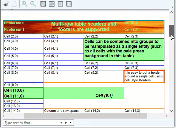
Groups are a very powerful feature of tables. Groups allow accessing several elements of a table as a whole (for example, the style can be set on a group as if it were a single element). Supported are groups of columns, groups of rows, and groups of cells.
To access a group of rows, use the collection RowGroups (which has the type TableVectorGroupCollection). Elements of that collection have the type TableVectorGroup, with some useful properties defined on that type. One of the more interesting of those properties is ColumnHeader. That property allows assigning a group of rows to be a table header, to be repeated at the top of each new page or page column. A related property is ColumnFooter, which allows to assign a group of rows to be a table footer, again repeated either at the end of each page or page column.
The following line of code shows how to assign the first 2 rows of a table to be the table header, repeated after each page or column break (rt1 here is a RenderTable object):
| C# |
Copy Code
|
|---|---|
rt1.RowGroups[0, 2].Header = C1.C1Preview.TableHeaderEnum.Page; |
|
As seen above, the indexer on the TableVectorGroupCollection class accepts two integers. The first value is the index of the first row included in the group (0 in the code example above). The second value is the count of rows in the group (2 in the code example above).
To access a group of columns, the collection ColGroups should be used. It has the same type as the row groups' collection (TableVectorGroupCollection), and provides the same functionality. Of particular interest is the ability to assign a group of columns to be a vertical table header or footer. C1PrintDocument supports "horizontal" (or "extension") pages, which allow wide objects to span several pages horizontally. To allow an object (for example, a table) to span several pages horizontally, set its SplitHorzBehavior to a value other than SplitBehaviorEnum.Never. If the object's width is wider than the page width, it will be split into several horizontal pages. In particular, a wide table can be split in this way. To make a group of columns repeat along the left edge of each page, set the group's ColumnHeader property to True. To make a group of columns repeat along the right edge of each page, set the group's ColumnFooter property to True.
Here is an example of code that creates a table with 100 rows and 10 columns, sets the width of the table to Auto, explicitly sets the width of each column to 1 inch, and also assigns horizontal and vertical table headers and footers:
| c# |
Copy Code
|
|---|---|
// Create and fill the table. RenderTable rt1 = new RenderTable(); for (int row = 0; row < 100; ++row) { for (int col = 0; col < 6; ++col) { rt1.Cells[row, col].Text = string.Format("Text in cell({0}, {1})", row, col); } } // Set the table and columns' widths. rt1.Width = Unit.Auto; for (int col = 0; col < 6; ++col) { rt1.Cols[col].Width = "1in"; } // Assign the first 2 rows as the header and set the background. rt1.RowGroups[0, 2].PageHeader = true; rt1.RowGroups[0, 2].Style.BackColor = Color.Red; // Assign the last 2 rows as the footer and set the background. rt1.RowGroups[98, 2].PageFooter = true; rt1.RowGroups[98, 2]. Style.BackColor = Color.Blue; // Assign the first column as the header. rt1.ColGroups[0, 1].PageHeader = true; rt1.ColGroups[0, 1].Style.BackColor = Color.BlueViolet; // Assign the last column as the footer. rt1.ColGroups[5, 1].PageFooter = true; rt1.ColGroups[5, 1].Style.BackColor = Color.BurlyWood; |
|
You can add styling attributes to the table in PrintDocument using the RenderObject.Style property of the RenderTable object.
The C1.C1Preview.Style class provides the Gridlines property to set the grid lines used to draw tables. Each gridline is represented by a C1.C1Preview.LineDef object, where the LineDef class provides properties for setting attributes to draw lines.
You can also define row and column styles, or define a cell group with a background color using the Style property.
The code snippet below depicts RenderTable styling:
| C# |
Copy Code
|
|---|---|
const int ROWS = 12; const int COLS = 6; RenderTable rt = new RenderTable(doc); for (int row = 0; row < ROWS; ++row) { for (int col = 0; col < COLS; ++col) { RenderText celltext = new RenderText(doc); celltext.Text = string.Format("Cell ({0},{1})", row, col); rt.Cells[row, col].RenderObject = celltext; } } // add the table to the document doc.Body.Children.Add(rt); // set up table style rt.Style.GridLines.All = new LineDef("2pt", Color.Black); rt.Style.GridLines.Horz = new LineDef("1pt", Color.Gray); rt.Style.GridLines.Vert = new LineDef("1pt", Color.Gray); // define a row style rt.Rows[4].Style.Font = new Font("Arial", 12, FontStyle.Bold | FontStyle.Italic); // define a column style rt.Cols[1].Style.TextColor = Color.DarkOrange; // define a cell group with a background color rt.UserCellGroups.Add(new UserCellGroup(new Rectangle(1, 4, 2, 3))); rt.UserCellGroups[0].Style.BackColor = Color.PaleGreen; |
|