PropertyGrid for WPF | ComponentOne
In This Topic
    Quick Start
    In This Topic

    Like the standard Microsoft PropertyGrid control, the WPF PropertyGrid control works based on a SelectedObject property. Once this property is set, the control displays the object's public properties and allows the user to edit them. In this quick start, we add PropertyGrid to the WPF application to create a UI to display and edit information in the PropertyGrid control.

    To bind an object with PropertyGrid, follow these steps:

    Set up the application

    1. Create a new WPF project in Visual Studio.
    2. In the Solution Explorer, right-click the Dependencies and select Manage NuGet packages.
    3. In the NuGet Package Manager, search and add the following reference to your project:
      • C1.WPF.PropertyGrid
    4. Navigate to the Toolbox and double-click the Button to add a standard button control to the window. Now, from the Properties window, set its Name to "TextButton" and Content to "Button".
    5. In the XAML view, add the C1PropertyGrid control and set its properties using the following code.
      XAML
      Copy Code
      <c1:C1PropertyGrid Margin="0,0,184,10" x:Name="propertyGrid"></c1:C1PropertyGrid>
      

    Back to Top

    Bind PropertyGrid with a Button

    To customize and connect the C1PropertyGrid control to the Button control, complete the following steps:

    1. In XAML view, bind the C1PropertyGrid control to the Button control and then customize the controls.
    2. Set the object for PropertyGrid to display properties using SelectedObject property as shown the following code. In this example, the SelectedObject property determines the object for which the PropertyGrid control displays properties to edit.
      XAML
      Copy Code
      <c1:C1PropertyGrid  Margin="0,0,184,10" x:Name="propertyGrid" PropertySort="CategorizedAlphabetical" AutoGenerateProperties="False" SelectedObject="{Binding ElementName=TextButton, Mode=OneWay}" EditorWidth="60" Grid.RowSpan="2">
          <c1:C1PropertyGrid.PropertyAttributes>
              <c1:PropertyAttribute Category="Appearance" DisplayName="Background Color" MemberName="Background" />
              <c1:PropertyAttribute Category="Appearance" DisplayName="Border Color" MemberName="BorderBrush"/>
              <c1:PropertyAttribute Category="Appearance" DisplayName="Visibility" MemberName="Visibility" />
              <c1:PropertyAttribute Category="Size" DisplayName="Button Height" MemberName="Height" />
              <c1:PropertyAttribute Category="Size" DisplayName="Button Width" MemberName="Width" />
              <c1:PropertyAttribute Category="Text" DisplayName="Button Text" MemberName="Content" />
              <c1:PropertyAttribute Category="Text" DisplayName="Text Color" MemberName="Foreground" />
              <c1:PropertyAttribute Category="Text" DisplayName="Text Size" MemberName="FontSize" />
      
          </c1:C1PropertyGrid.PropertyAttributes>
      </c1:C1PropertyGrid>
      

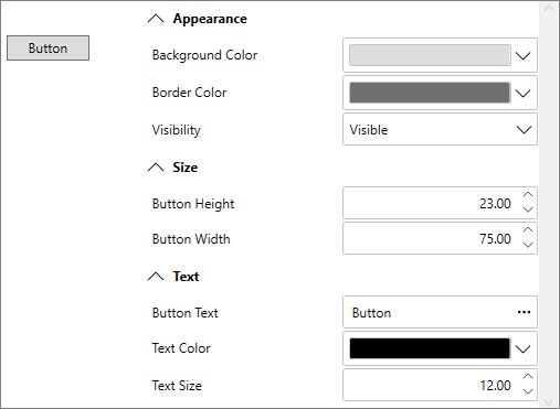
      You will notice in Design view that the C1PropertyGrid control now reflects all of the button’s properties.

    3. In the Properties window, locate the PropertyAttributes collection under Data category and click the ellipsis button next to it. The Property Attribute Collection Editor dialog box will appear.
    4. In the Property Attribute Collection Editor, click the Add button to add items to the PropertyGrid. Repeat this step seven more times to create a total of eight PropertyAttribute items.
    5. Set the following properties in the Properties pane (on the right side) for the items you just added:

      PropertyAttribute

      Category

      DisplayName

      MemberName

      [0] PropertyAttribute

      Appearance

      Background Color

      Background

      [1] PropertyAttribute

      Appearance

      Border Color

      BorderBrush

      [2] PropertyAttribute

      Appearance

      Visibility

      Visibility

      [3] PropertyAttribute

      Size

      Button Height

      Height

      [4] PropertyAttribute

      Size

      Button Width

      Width

      [5] PropertyAttribute

      Text

      Button Text

      Content

      [6] PropertyAttribute

      Text

      Text Color

      Foreground

      [7] PropertyAttribute

      Text

      Text Size

      FontSize

      Here, the Category identifies what section the item appears in, the DisplayName indicates the name displayed for the item and the MemberName indicates the actual name of the member.

    6. Click the OK button to close the Property Attribute Collection Editor dialog box and change the settings.

    Back to Top

    Run the application

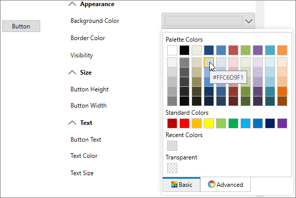
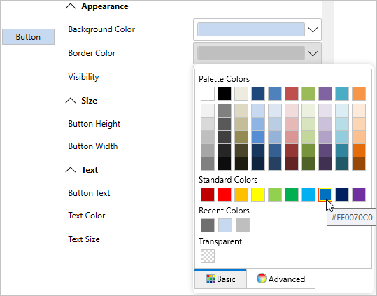
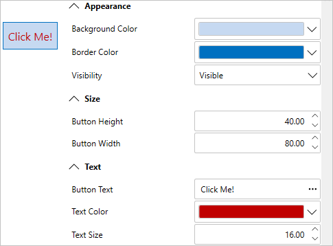
    To run your application and observe the run-time behavior of the PropertyGrid control, complete the following steps:

    1. From the Debug menu, select Start Debugging to view how your application will appear at run time. The application will appear similar to the following:
      WPF PropertyGrid bound with button to change it's properties
    2. Click the Background Color drop-down arrow and pick a color, for example, light blue, from the color picker that appears. The button's background color will change to your selection.
      Change in button background color using WPF PropertyGrid
    3. Click the Border Color drop-down arrow and pick a color, for example blue, from the color picker that appears.
      Change in button border color using WPF PropertyGrid
    4. Change the size of the button by entering values in the Button Height and Button Width numeric boxes. For example, enter 40 for height and 80 for width.
    5. Enter a string, for example "Click Me!" in the Button Text box.
    6. Click the Text Color drop-down arrow and pick a color, for example maroon, from the color picker that appears.
    7. Click the Up or Down arrow next to the Text Size value to change the size of the text that appears on the button control. For example, set the value to 16.
      Change in different properties of button using WPF PropertyGrid

    Back to Top

    To bind a class with PropertyGrid, follow these steps:

    Set up the application

    1. Create a new WPF project in Visual Studio.
    2. In the Solution Explorer, right-click the Dependencies and select Manage NuGet packages.
    3. In the NuGet Package Manager, search and add the following reference to your project:
      • C1.WPF.PropertyGrid
    4. In the XAML view, add the C1PropertyGrid control and set its properties using the following code.
      XAML
      Copy Code
      <c1:C1PropertyGrid Margin="130,12,30,12" x:Name="propertyGrid"></c1:C1PropertyGrid>
      

    Back to Top

    Bind PropertyGrid with a Class

    To customize and connect the PropertyGrid control to the class, complete the following steps:

    1. Switch to the code view and create a class, say Customer, using the following code.
      C#
      Copy Code
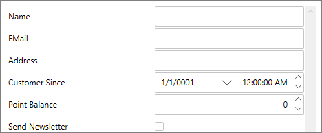
      public class Customer
      {
          
          public string Name { get; set; }
          public string EMail { get; set; }
          public string Address { get; set; }
          public DateTime CustomerSince { get; set; }
          public int? PointBalance { get; set; }
          public bool SendNewsletter { get; set; }
      }
      
    2. Create an object of the Customer class and bind it to the PropertyGrid using SelectedObject property as shown the following code. In this example, the SelectedObject property determines the object of the class for which the PropertyGrid control displays properties to edit.
      C#
      Copy Code
      // Create object to browse
      var customer = new Customer();
      
      // Show customer properties
      propertyGrid.SelectedObject = customer;
      

    Back to Top

    Run the application

    Observe the output appears similar to the following:

    PropertyGrid bound to class

    Back to Top