The toggle button is a button that allows the user to switch between two states. When a user clicks on a toggle button, it switches to the pressed/active state and on consecutive clicking, it returns back to the unpressed/inactive state. The toggle button is represented using the C1ToggleButtonTool class.
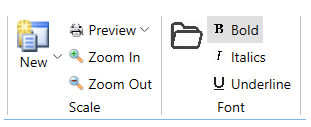
In the image above, the Bold, Italics and Underline buttons in the Font group are all toggle buttons. Note that the Bold toggle button is in checked state using the IsChecked property.
The code snippet shows how to add toggle buttons:
| XAML |
Copy Code
|
|---|---|
<c1:C1ToggleButtonTool Label="Bold" IsChecked="True"> <c1:C1ToggleButtonTool.IconTemplate> <c1:C1IconTemplate> <c1:C1BitmapIcon Source="/bold.png"/> </c1:C1IconTemplate> </c1:C1ToggleButtonTool.IconTemplate> </c1:C1ToggleButtonTool> <c1:C1ToggleButtonTool Label="Italics"> <c1:C1ToggleButtonTool.IconTemplate> <c1:C1IconTemplate> <c1:C1BitmapIcon Source="/italic.png"/> </c1:C1IconTemplate> </c1:C1ToggleButtonTool.IconTemplate> </c1:C1ToggleButtonTool> <c1:C1ToggleButtonTool Label="Underline"> <c1:C1ToggleButtonTool.IconTemplate> <c1:C1IconTemplate> <c1:C1BitmapIcon Source="/underline.png"/> </c1:C1IconTemplate> </c1:C1ToggleButtonTool.IconTemplate> </c1:C1ToggleButtonTool> |
|