A theme is a ResourceDictionary containing a collection of different resources such as Brushes and Styles and DataTemplates that target the WPF controls. The C1Scheduler and C1Calendar controls are composed of many smaller parts, each of which is created dynamically at run-time. All of these parts are described in a theme dictionary as a reusable resource. For example, there is only one Style definition for the Day Header which is used in all views.
For brush resources, it is good practice to define every brush once, assign a unique key to it, and then use it later as a theme property for the styles and templates. Here is a XAML example of a brush defined and then used in a style setter and border background:
| XAML |
Copy Code
|
|---|---|
<!—- determines brush as frozen (for better performance) --> <LinearGradientBrush x:Key="DayHeaderBrush" StartPoint="0,0" EndPoint="0,1" PresentationOptions:Freeze="true"> <GradientStop Color="#DDFFFFFF" Offset="0" /> <GradientStop Color="#CAFFFFFF" Offset="0.5" /> <GradientStop Color="#AAFFFFFF" Offset="0.6" /> <GradientStop Color="#DDFFFFFF" Offset="1" /> </LinearGradientBrush> <!—- use brush in style setter --> <Setter Property="Background" Value="{Binding Path=Scheduler.Theme[DayHeaderBrush]}" /> <!—- use brush as border background --> <Border Name="gradBrushRect" Background="{Binding RelativeSource={RelativeSource AncestorType={x:Type local:C1Scheduler}}, Path=Theme[DayHeaderBrush]}" /> |
|
So, what are the "smaller parts" composing C1Scheduler? The VisualInterval is the key here. For the Month View, they are usually a one-day interval. For the Day View, they are the smallest time slot of several minutes. These intervals can be grouped into bigger parts. For example, in the Month view, intervals are grouped into weeks, and in the Day View, minutes are grouped into hours and hours are grouped into days. So, to determine the C1Scheduler appearance, we have to determine appearance of all these individual parts.
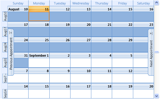
The next two images show how resource keys used in default themes correspond to UI representation. The first example is a schedule in Month View:
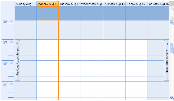
The second example is a schedule in Week View:
The first step at creating a new theme should be an understanding of how to split up the whole picture into smaller parts. Then you can create resources, styles, and templates for those smaller parts and use them for creating a new style for the whole control. Basically, if you keep the same resource keys which are used in the C1Scheduler source XAML, then you can re-template only some of the smaller parts which will be used automatically by default styles.