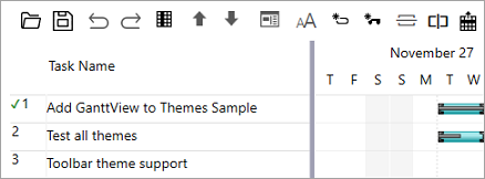
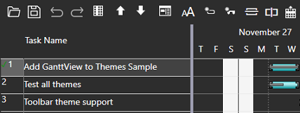
The available themes are inspired by Microsoft Office, Expression Blend, the Silverlight toolkit themes as well as Modern UI.
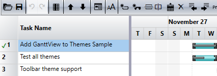
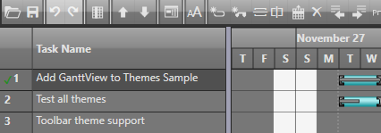
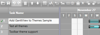
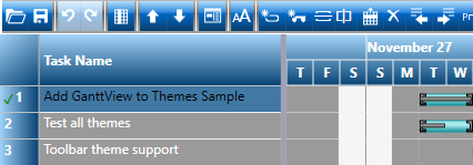
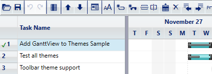
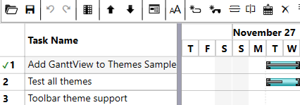
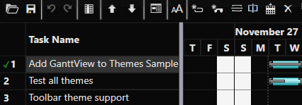
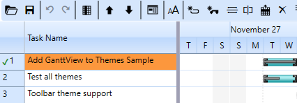
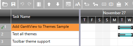
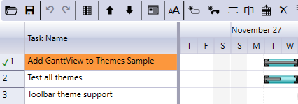
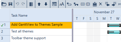
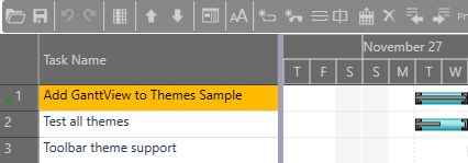
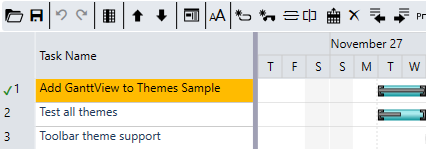
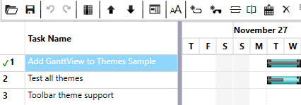
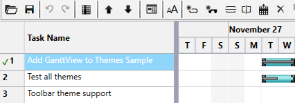
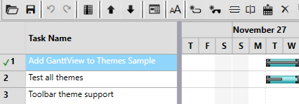
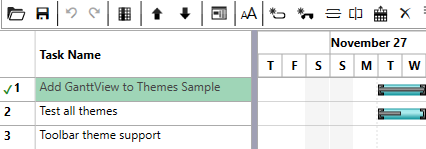
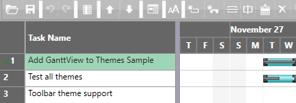
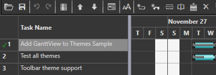
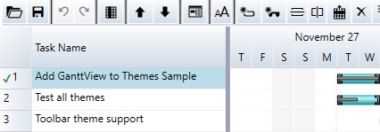
The following table illustrates all the available theme styles:
| Theme | Appearance |
|---|---|
| BureauBlack |
|
| ExpressionDark |
|
| ExpressionLight |
|
| ShinyBlue |
|
| WhistlerBlue |
|
| Cosmopolitan |
|
| CosmopolitanDark |
|
| Office2007Blue |
|
| Office2007Black |
|
| Office2007Silver |
|
| Office2010Blue |
|
| Office2010Black |
|
| Office2010Silver |
|
| Office2013White |
|
| Office2013LightGray |
|
| Office2013DarkGray |
|
| Office2016White |
|
| Office2016Colorful |
|
| Office2016DarkGray |
|
| Office2016Black |
|
| C1Blue |
|
| Material |
|
| MaterialDark |
|
| System | 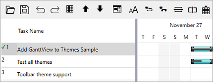 |
Each theme depends on the base ComponentOne Theming library (C1.WPF.Theming).