You can use ContentTemplates and BackContentTemplates to customize the appearance of the C1Tiles controls. Place the content you want to appear initially in the tile in the ContentTemplate and place content that you want to appear when the tile slides alternative content in the BackContentTemplate.
For example, the following markup adds a ContentTemplate and a BackContentTemplate to a C1SlideTile control:
| XAML |
Copy Code
|
|---|---|
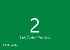
<c1:C1SlideTile Content="2" HeaderPadding="12" HorizontalContentAlignment="Stretch" VerticalContentAlignment="Stretch" Padding="0" Header="C1SlideTile"> <c1:C1Tile.ContentTemplate> <DataTemplate> <Border Background="#FFBC1C48" > <TextBlock Text="{Binding}" VerticalAlignment="Center" HorizontalAlignment="Center" /> </Border> </DataTemplate> </c1:C1Tile.ContentTemplate> <c1:C1Tile.BackContentTemplate> <DataTemplate> <Border Background="#FF028541" > <StackPanel VerticalAlignment="Center" HorizontalAlignment="Center"> <TextBlock Text="{Binding}" Foreground="White" HorizontalAlignment="Center"/> <TextBlock Text="Back Content Template" Margin="0 -10 0 0" FontSize="12" Foreground="White" HorizontalAlignment="Center"/> </StackPanel> </Border> </DataTemplate> </c1:C1Tile.BackContentTemplate> </c1:C1SlideTile> |
|
At run time, the control will initially appear like the following with the ContentTemplate displayed:

After transitioning to the alternative content template, the control will appear with the following BackContentTemplate displayed: