You can define the same size (small, medium, or large) for all C1ToolbarButtons and C1ToolbarToggleButtons in a C1ToolbarGroup using the GroupSizeDefinition.
The GroupSizeDefinition defines the button sizes as small, medium, or large and the position of the button text in a C1ToolbarGroup. If "large" is used then all the buttons in the group gets the image size from the LargeImageResource property and positions the text value of the LabelTitle property below the image. If "medium" is used then all buttons in the group gets the image size from the SmallImageResource property and positions the text value of the LabelTitle property to the right of the image. If "small" is used then all the buttons in the group gets the image size from the SmallImageResource property and does not show the text.
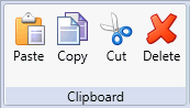
The following image displays the buttons as Large with the LargeImageResource property used and the text for the LabelTitle property shown below the image:
The following image displays the buttons as Medium with the SmallImageResource property used and the text for the LabelTitle property shown to the right of the image:

The following image displays the buttons as Small with the SmallImageResource property used:
