The C1ToolbarTablItem represents a tab item on the C1Toolbar. The C1ToolbarTabItems are beneficial to use when you have substantial amounts of information to display on minimum window space.
The C1ToolbarTabItem divides the controls onto a separate page and shows one tab at a time.
A C1ToolbarTabItem can hold a collection of C1ToolbarGroups which can contain C1ToolbarButtons, C1ToolbarToggleButtons, C1ToolbarDropDowns, and C1ToolbarSplitButtons.
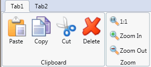
The following image displays two C1ToolbarTabItems:
A C1ToolbarTabItem can be added to C1Toolbar via the ToolbarItems collection editor, through XAML, or programatically.
To add a C1ToolbarTabItem using the designer, complete the following:
To add a C1ToolbarTabItem using XAML code, add the following:
| XAML |
Copy Code
|
|---|---|
<c1:C1Toolbar Grid.Row="1" Name="c1Toolbar1"> <c1:C1ToolbarTabItem Header="Tab 1"> <c1:C1ToolbarTabItem.Content> <c1:C1ToolbarPanel /> </c1:C1ToolbarTabItem.Content> </c1:C1ToolbarTabItem> </c1:C1Toolbar> |
|
C1ToolBarGroups can be added to the C1ToolbarTabItem via the Groups collection editor, through XAML, or programatically using the C1ToolbarTabItem.Groups property.
To add a C1ToolbarGroup to the C1ToolbarTabItem using the designer, complete the following:
To add a C1ToolbarGroup to a C1ToolbarTabItem using XAML code, add the following:
| XAML |
Copy Code
|
|---|---|
<c1:C1Toolbar Grid.Row="1" Name="c1Toolbar1"> <c1:C1ToolbarTabItem Header="Tab 1"> <c1:C1ToolbarTabItem.Content> <c1:C1ToolbarPanel /> </c1:C1ToolbarTabItem.Content> <c1:C1ToolbarGroup/> </c1:C1ToolbarTabItem> </c1:C1Toolbar> |
|
The C1ToolBarTabItem includes the following unique property:
|
Property |
Definition |
|
Gets the collection of toolbar groups. |