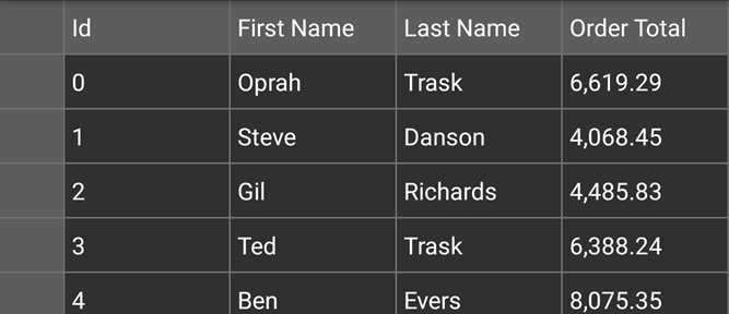
You can use star sizing to implement flexible layouts with the FlexGrid. The sample below uses star sizing specified in the Width property of the object.
This grid has four columns. The width for all the four columns is set using the GridLength, which defines the size of the columns.
The image below shows how the FlexGrid appears, after star sizing is applied to the FlexGrid control.
The following code example demonstrates star sizing in the FlexGrid control. The example uses the sample created in the Quick Start section.
| C# |
Copy Code |
|---|---|
grid.AllowResizing = GridAllowResizing.None; //Add Columns grid.Columns.Add(new GridColumn { Binding = "Id", Width = GridLength.Star}); grid.Columns.Add(new GridColumn { Binding = "FirstName", Width = GridLength.Star }); grid.Columns.Add(new GridColumn { Binding = "LastName", Width = GridLength.Star }); grid.Columns.Add(new GridColumn { Binding = "OrderTotal", Width = GridLength.Star, Format = "N"}); | |