C1 Xamarin controls match the native controls on all three platforms by default and are designed to work with both: light and dark themes available on all platforms. However, developers can choose to customize the appearance of the FlexChart control by setting some of the properties at design time. You can change the background color of the chart plot area, set the color of the series, add colored borders of specified thickness to charts as well as series; and do much more to enhance the appearance of the control.
The image below shows a customized FlexChart control.
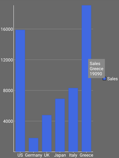
The following code example demonstrates how to customize the appearance of series appearing on the FlexChart control. This example uses the sample created in the Quick Start section with series added to the FlexChart control.
| C# |
Copy Code |
|---|---|
mChart.BackgroundColor = Color.DimGray;seriesSales.Style.Fill = Color.RoyalBlue;seriesSales.ChartType = ChartType.Column; | |