You can add a title to the FlexPie control by setting its Header property. In addition, you may also set a footer by setting the Footer property for the FlexPie control.
There are also some additional properties to customize header and footer text in a FlexPie.
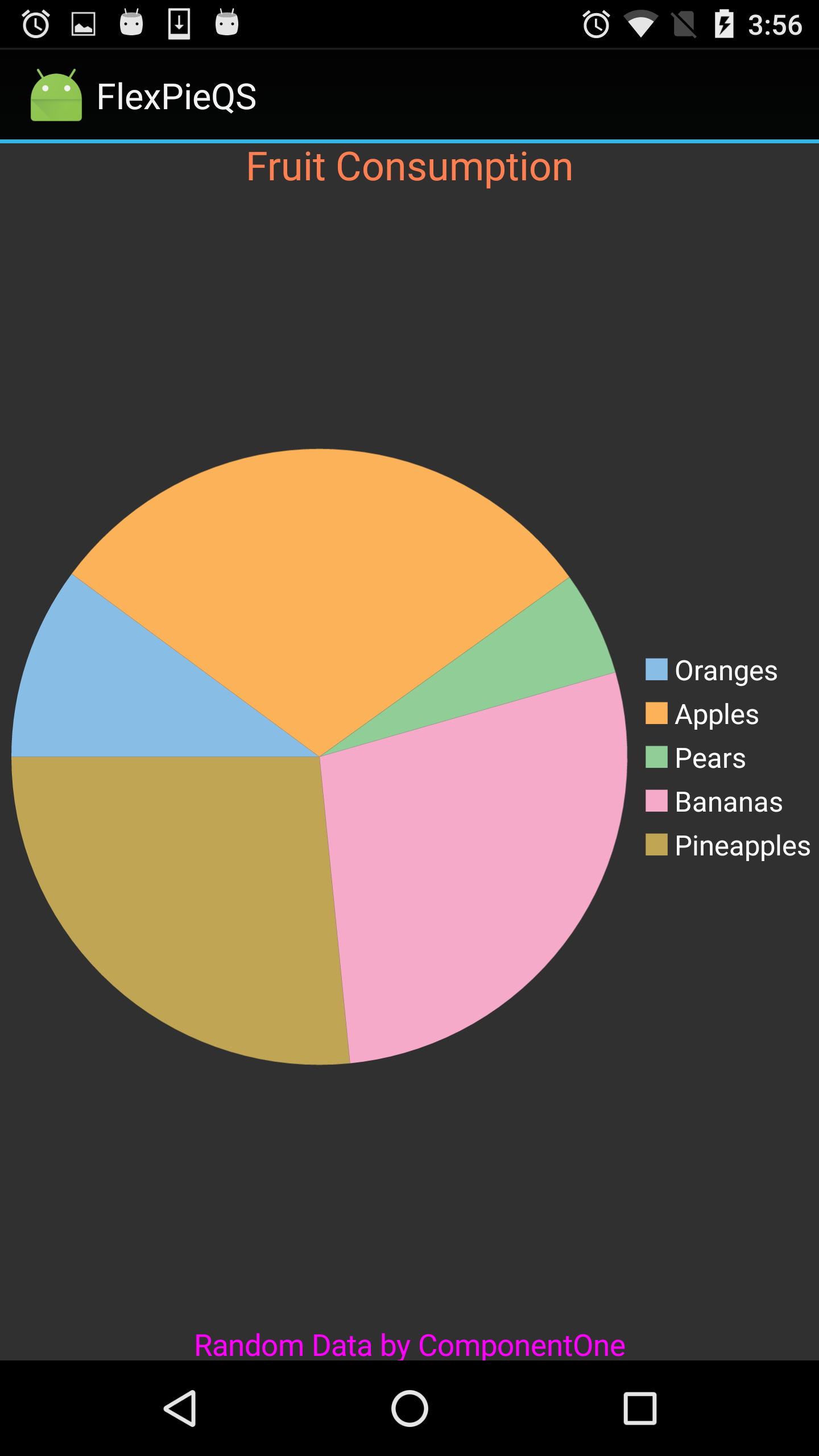
The image below shows how the FlexPie appears after these properties have been set.
The following code example demonstrates setting these properties in C#. These examples use the sample created in the Quick Start section.
| C# |
Copy Code |
|---|---|
// Setting the Header and Footer fpie.Header = "Fruit Consumption"; fpie.HeaderStyle.Fill = Color.Coral; fpie.HeaderStyle.FontSize = 20; fpie.Footer = "Random Data by ComponentOne"; fpie.FooterStyle.Fill = Color.Fuchsia; fpie.FooterStyle.FontSize = 15; | |