Xuni FlexPie provides the option to display legend for denoting the type of the data presented in the pie slices. The position of legend is by default set to "Auto", which means the legend positions itself automatically depending on the real estate available on the device. This allows the pie to efficiently occupy the available space on the device.
Users have the option to customize the appearance of the legend to enhance the visual appeal of the FlexPie control. To customize the legend, you can set the following properties at design time.
| Property | Description |
| LegendPosition |
This property accepts the following values from the ChartPositionType enumeration:
|
| LegendStyle | Sets the different styles of the legend. |
| LegendItemStyle | Sets the item style of the legend. |
The image below shows how the FlexPie appears after these properties have been set.
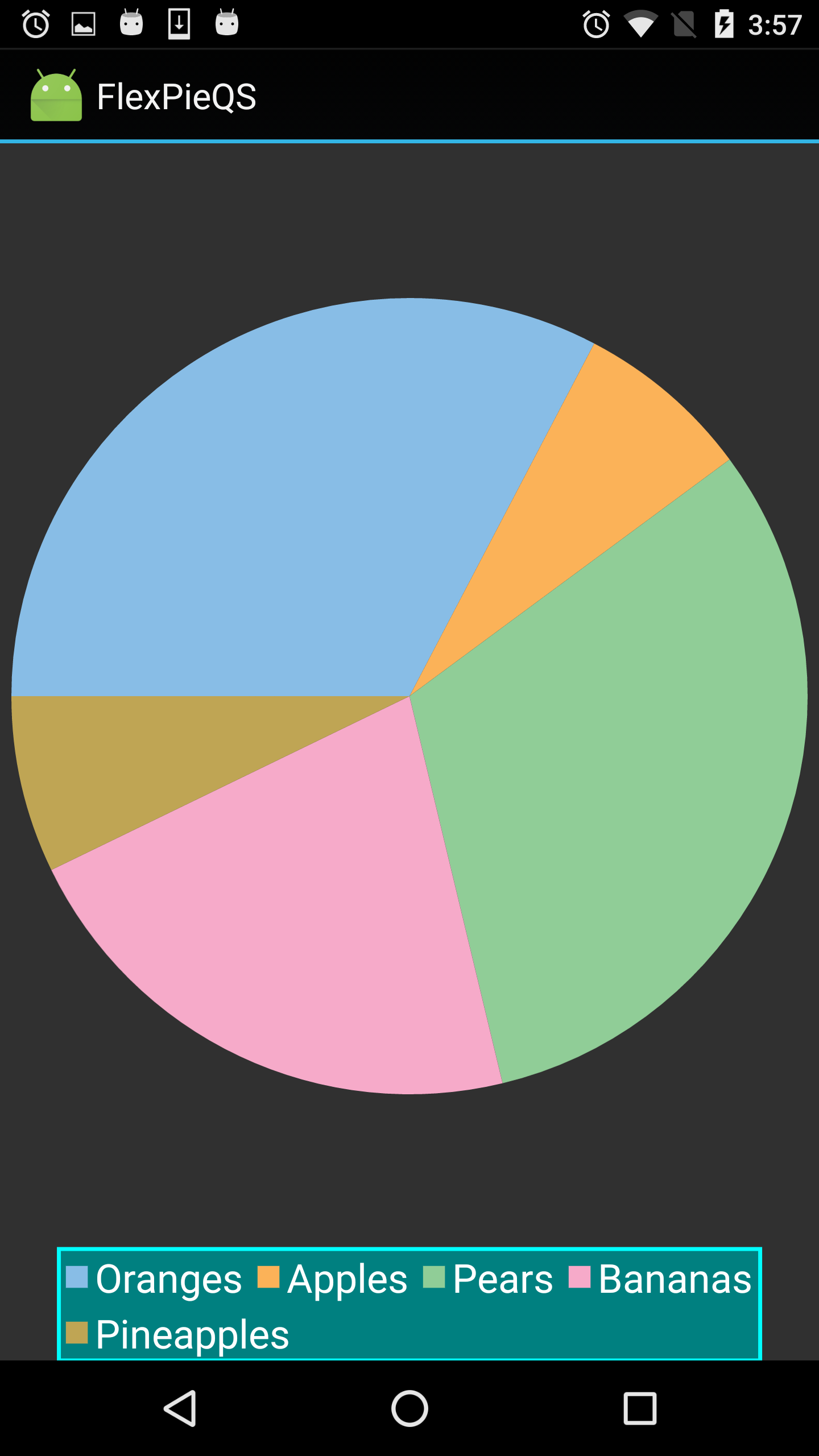
The following code examples demonstrate how to set these properties in C#. These examples use the sample created in the Quick Start section.
| C# |
Copy Code |
|---|---|
//Customize Legend
fpie.LegendPosition = ChartPositionType.Bottom;
fpie.LegendStyle.Stroke = Color.Aqua;
fpie.LegendStyle.Fill = Color.Teal;
fpie.LegendStyle.StrokeThickness = 2;
fpie.LegendItemStyle.FontSize = 20; | |